Making the most of the existing building
Putting the existing building to work
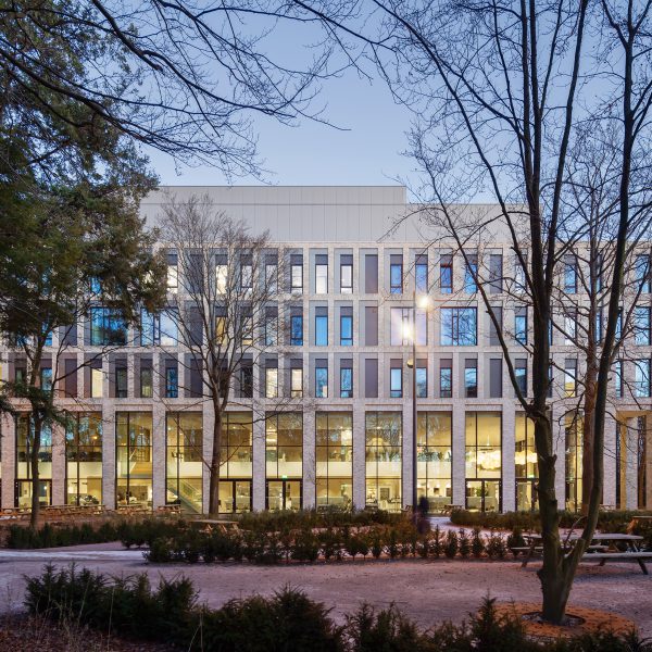
After designing Amphia Hospital’s new building, which opened in 2019, Wiegerinck was commissioned to design the renovation of the hospital’s existing building as well. This project was carried out with the same Amphia ambition: to take medicine and medical care to an even higher level and create an optimal environment for both patients and staff.
Outpatient care
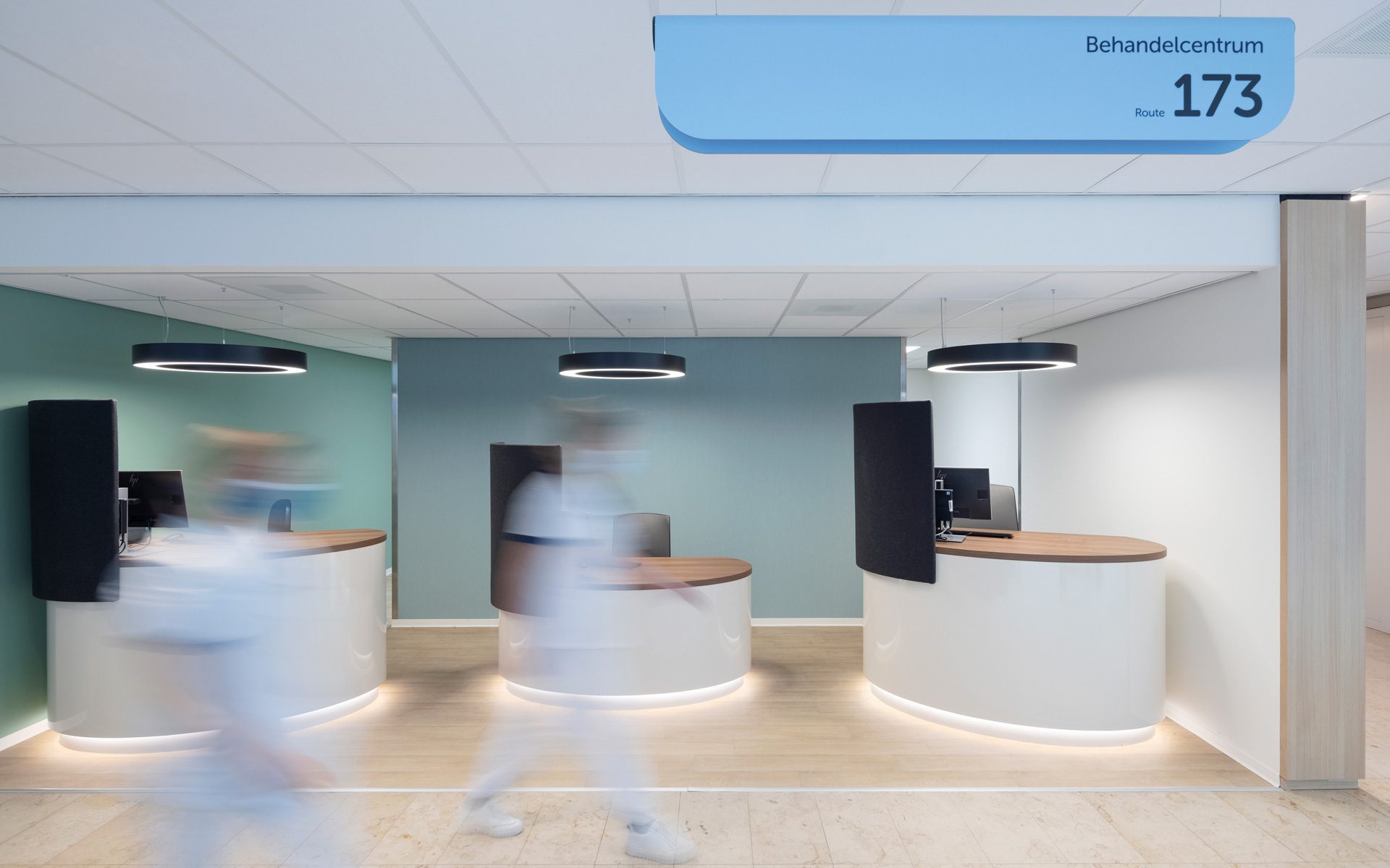
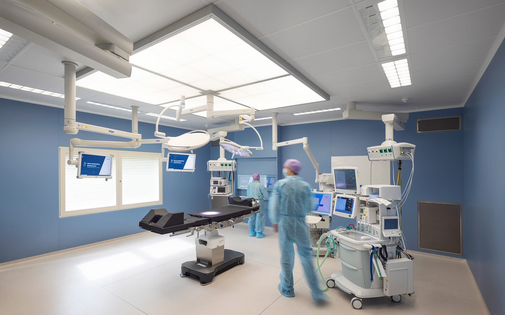
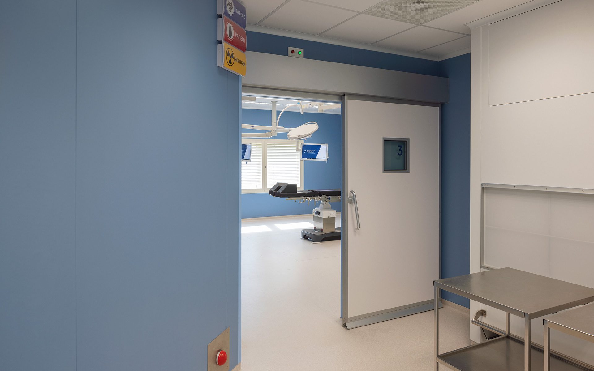
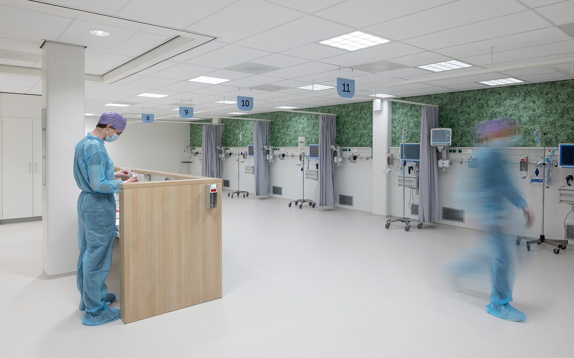
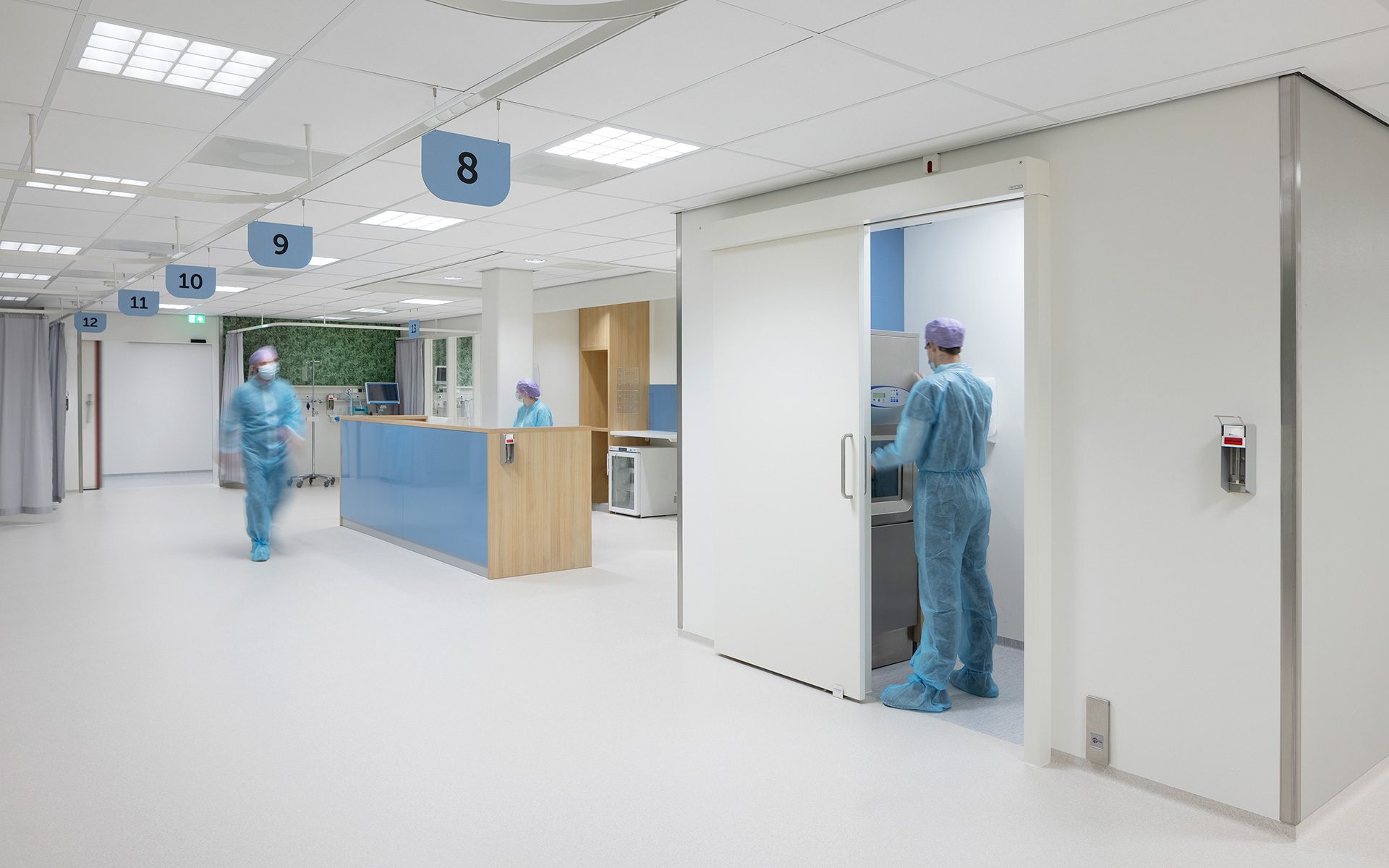
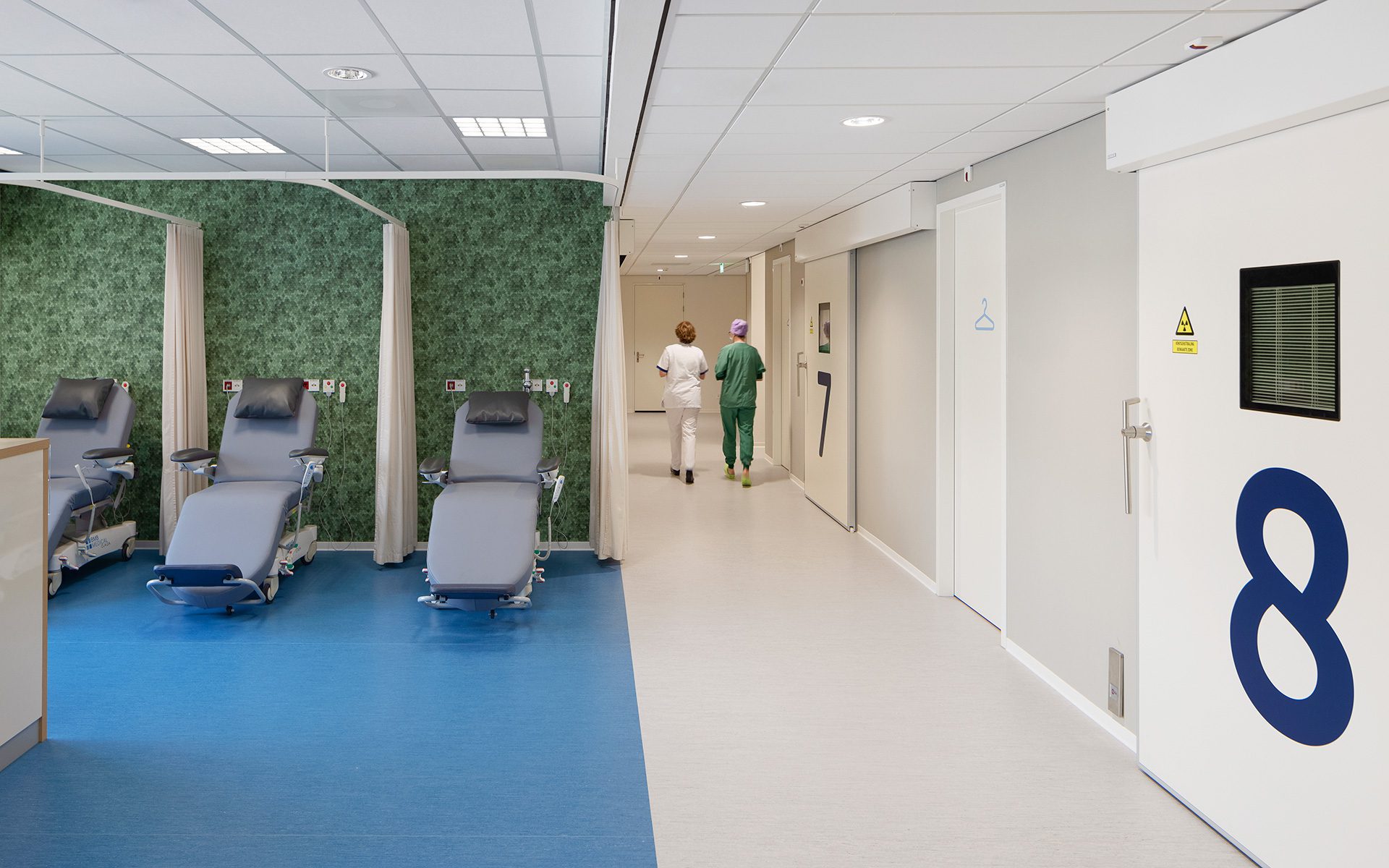
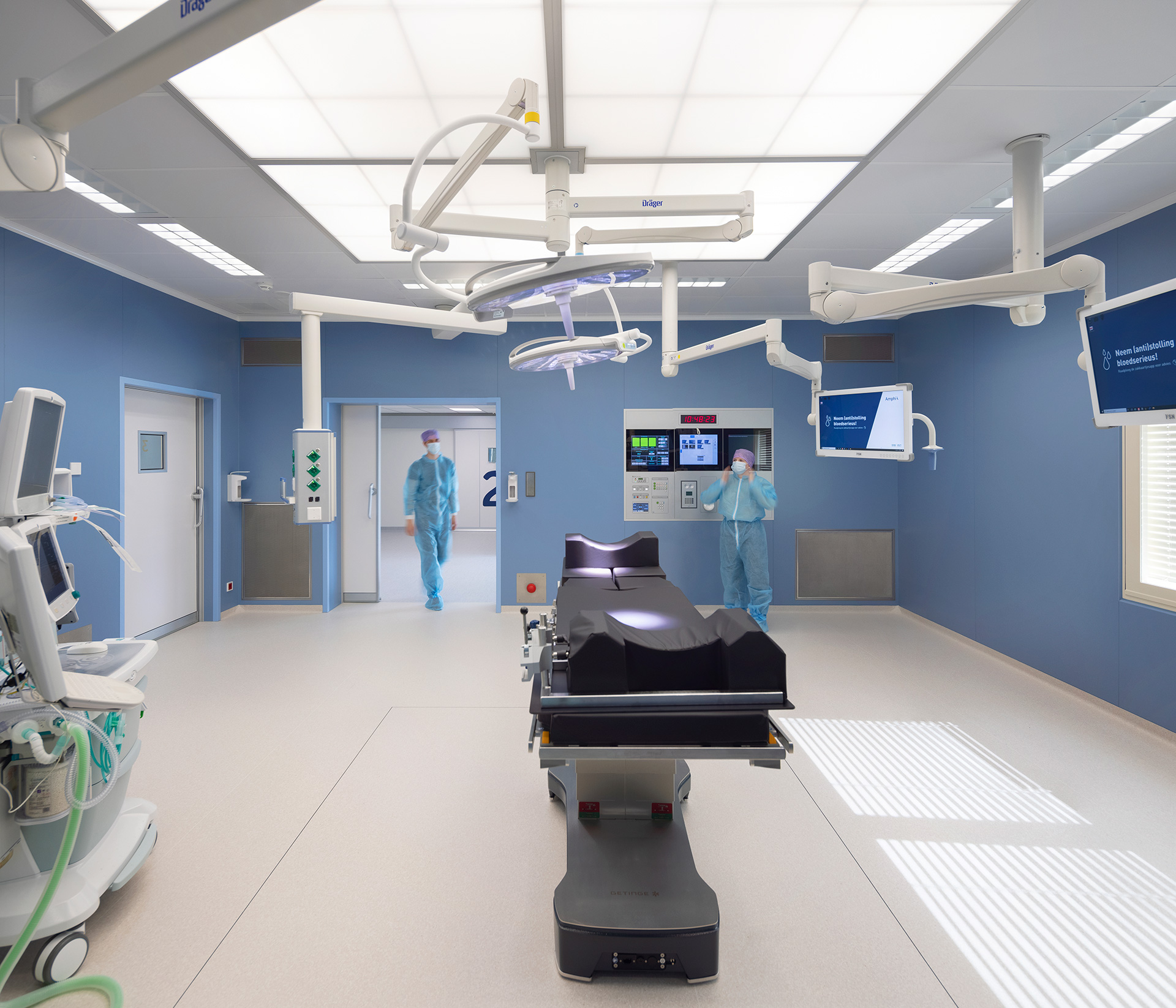
In the existing hospital building, space has been created for outpatient care and operations (orthopaedics, ENT, dermatology, plastic surgery, etc.) and other non-invasive procedures. These practices, also known as “high turnover” specialisms, mostly involve short-term procedures. The polyclinics in these specialisms will remain in the existing building as well, but they are renovated and given a new access structure.
Maintaining balance
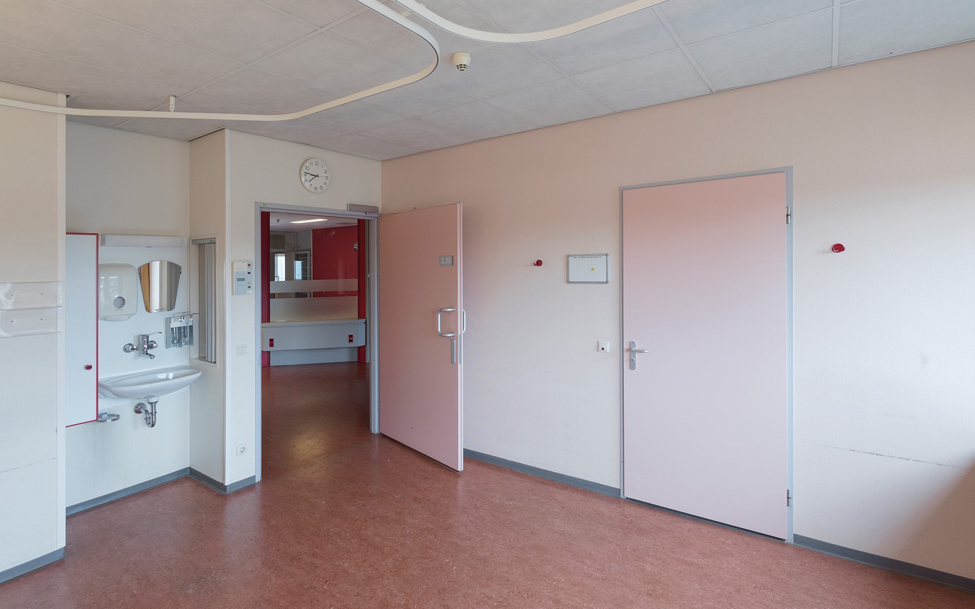
The renovation is a combination of heavy rebuilding of certain parts of the hospital and a substantial refurbishment of others. The art is in maintaining balance. Although the budgets and building requirements are leading factors, there are also the wishes and expectations of those who have to work and perform in the building on a daily basis to consider. And these users wanted to see certain elements of the new Amphia reflected in their building as well. In short, the goal was to combine the requirements, wishes and expectations in the best way possible—in other words, to please everyone while carrying out a complex process and remaining within budget.
Design Weeks
With one of the largest projects, the surgery centre, we started the process with Samen Ontwerp Weken (or Designing Together Weeks). During this period, we met with specialists, managers and nurses to discuss their future workplace. Many questions were brought to the table, such as: How flexible can we be? Can we also share spaces and facilities with other practices?
Personal signature
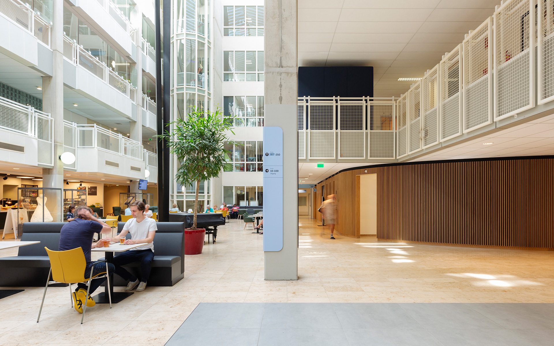
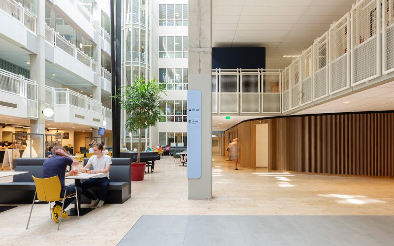
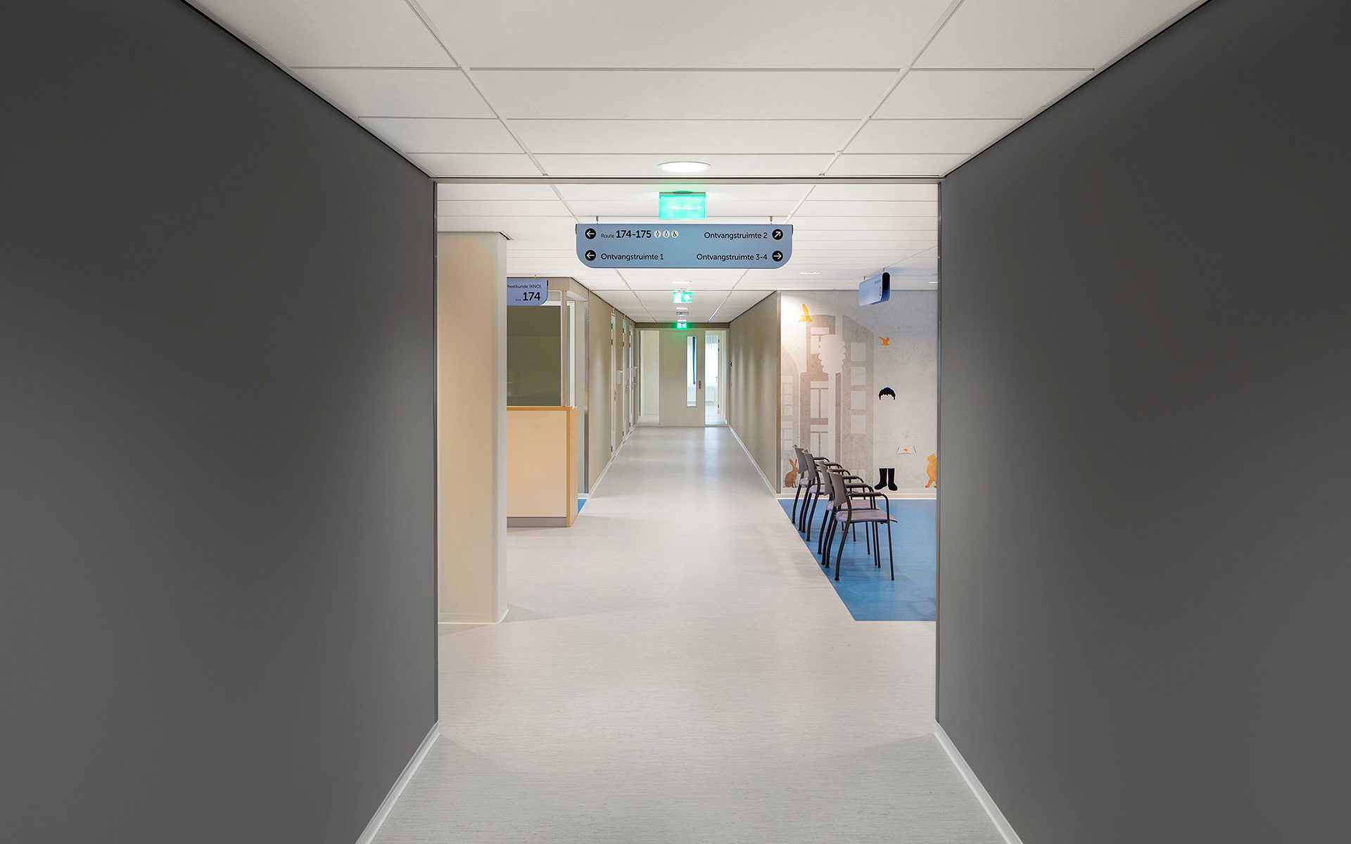
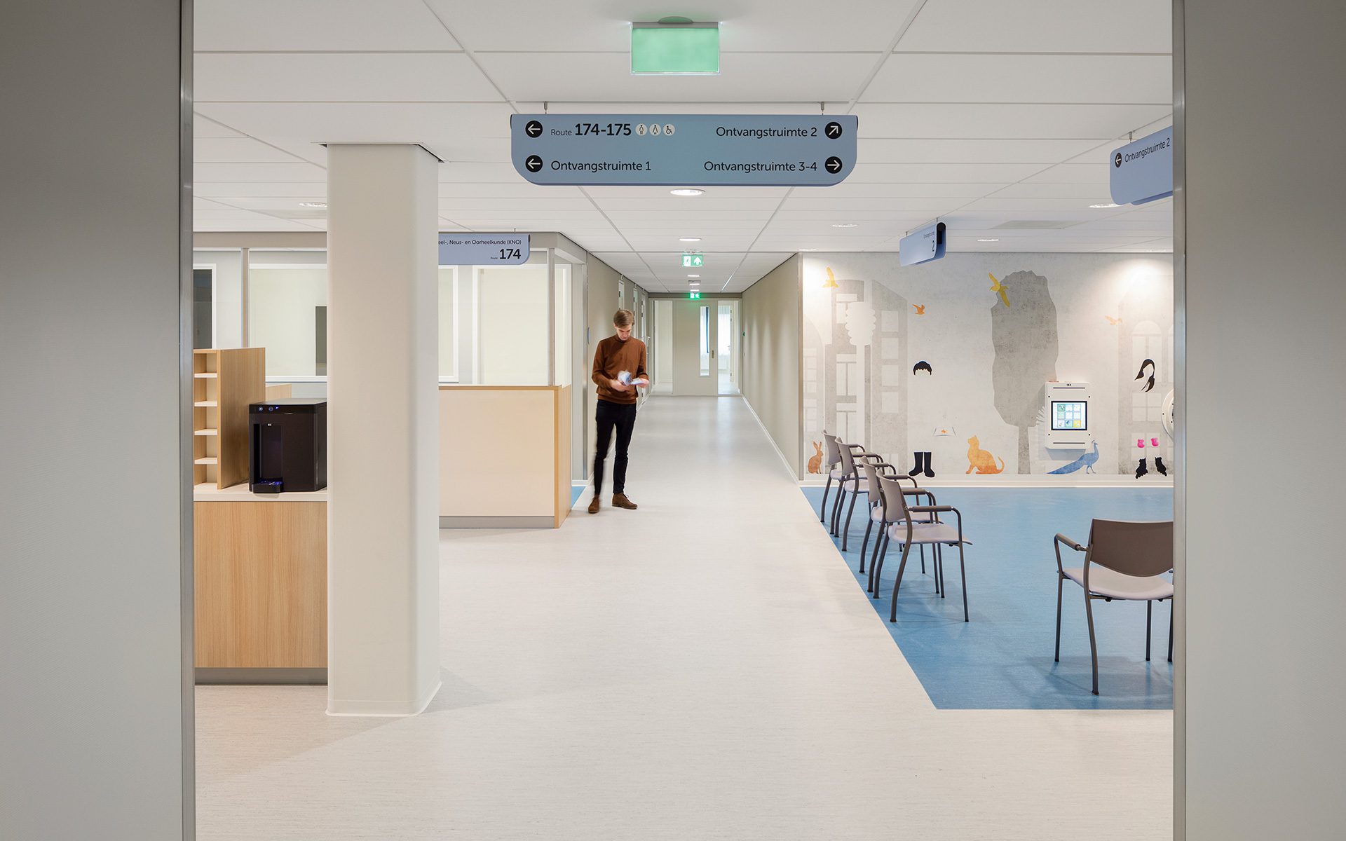
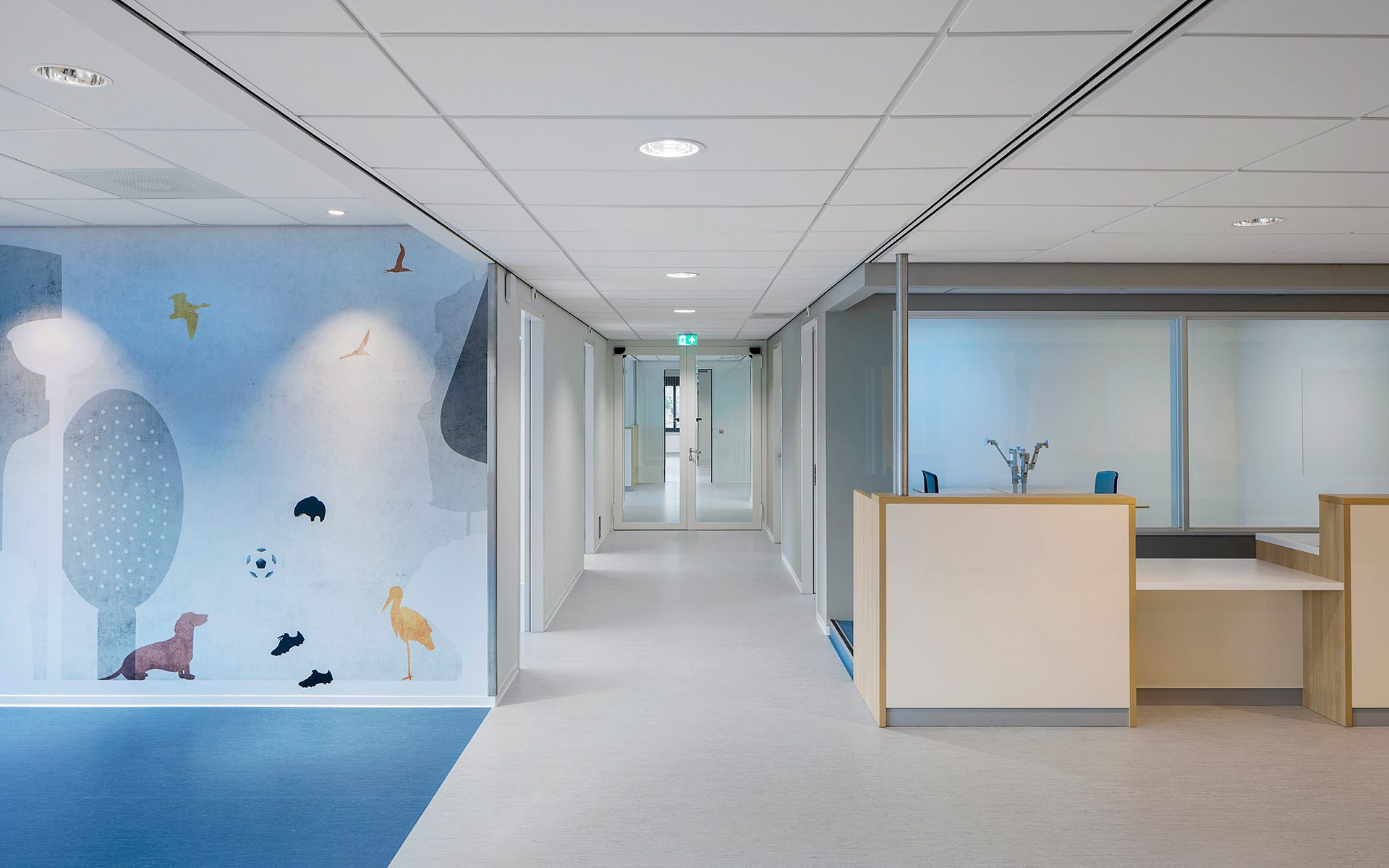
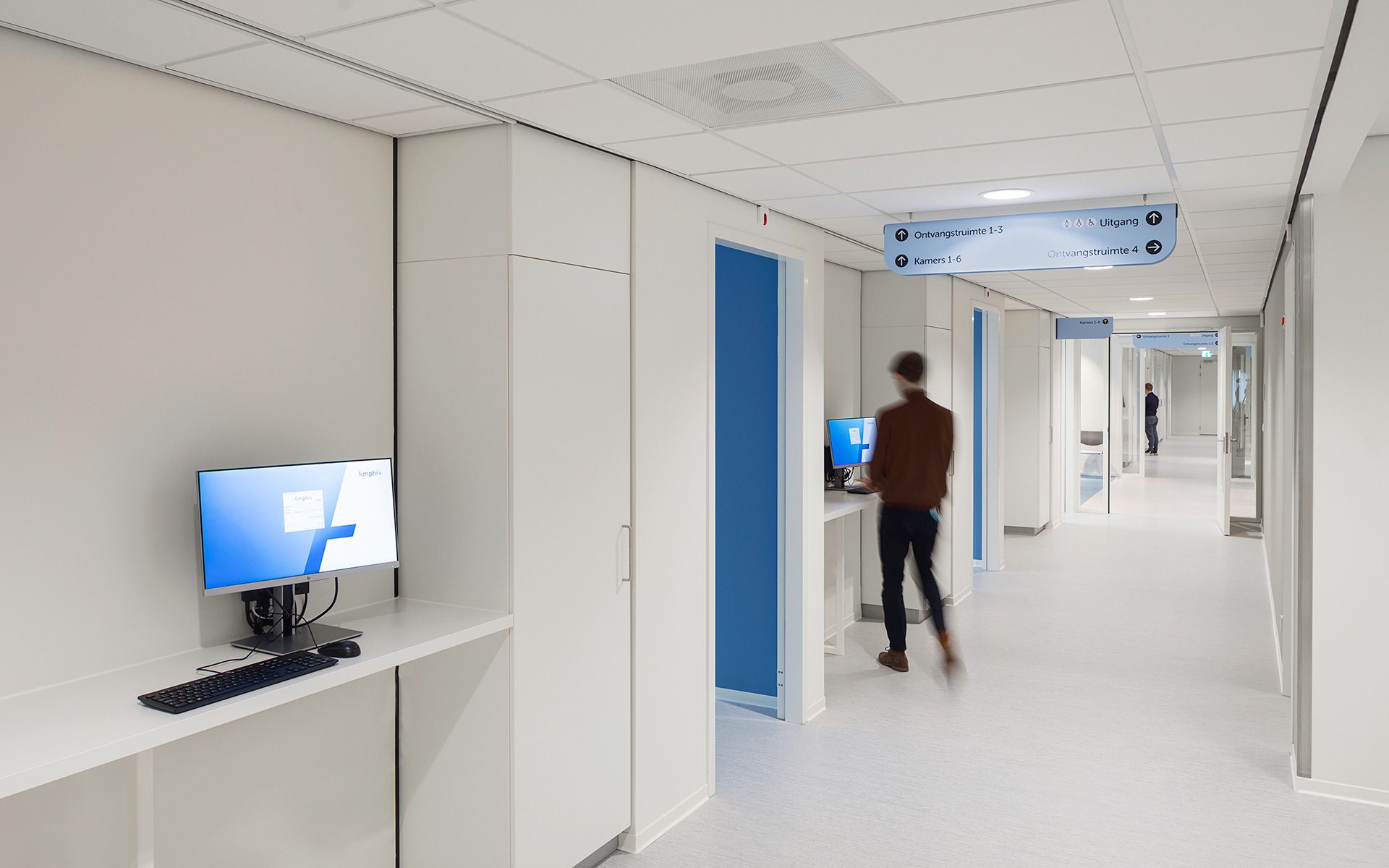
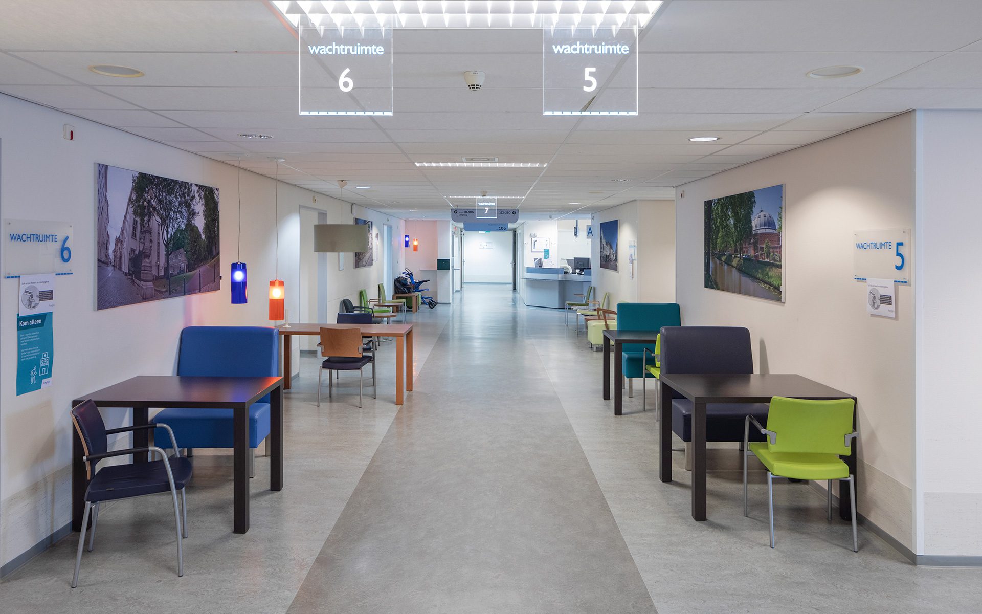
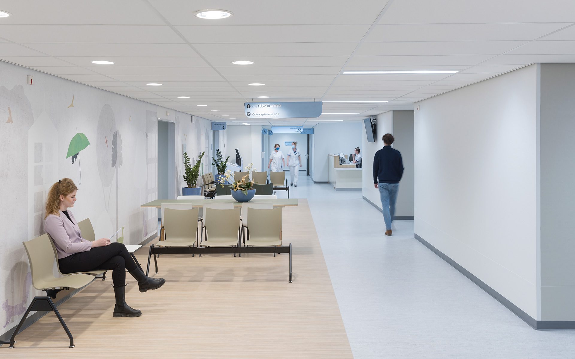
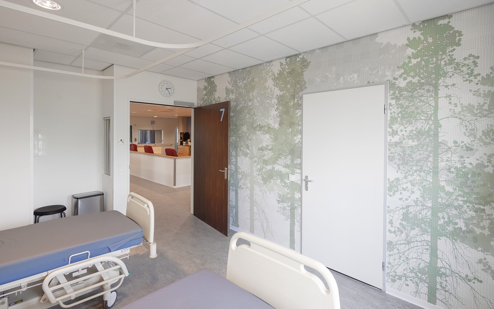
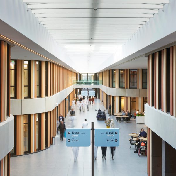
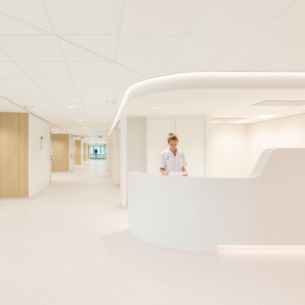
The five design principles from the new building formed the basis for the image quality plan for the existing building. Two of these principles were daylight & view and orientation & routing. But new concepts, such as the one-day outpatient centre, demanded their own identity as well, which called for creativity within the given frameworks. The initial designs were already there. When you leave the new hospital and enter the renovated building, you’ll notice that it has its own signature. Green is the leading colour, along with shades of white, grey and natural wood. The orientation is immediately clear. With one turn to the left or right, you’ll find yourself in a wide corridor, always with daylight at the end, that will take you to the department or clinic where you need to be. In the surgery centre, special attention has been paid to the lounges, where patients can rest after an operation before returning home.


