Laurentius Hospital Hotfloor
Roermond, the Netherlands
A new heart for an
85-year-old hospital
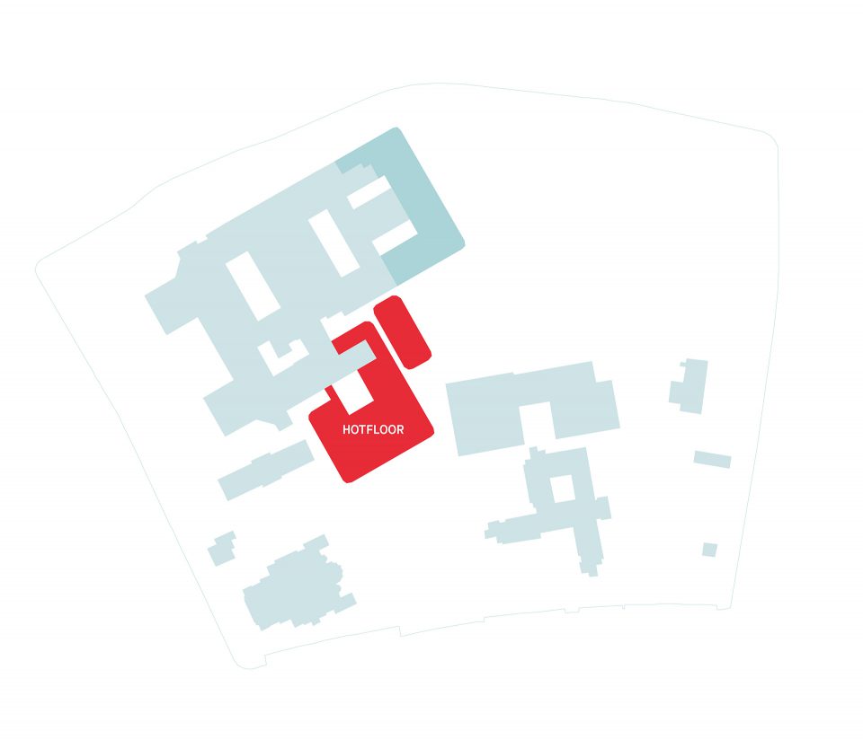
The Laurentius Hospital in Roermond was founded in the 1930s. After several expansions, the hotfloor—the most technically complex part of the hospital, where functions such as the OR and radiology are located—had been maxed out over the years. There was literally no way to expand it, even though the functions housed in it were growing and in urgent need of renovation. There was already a plan for new construction, and the hospital asked Wiegerinck to develop the structural plan. We took a closer look at the construction plans and concluded that, in fact, a completely new building wasn’t necessary—things could be done differently.
Connecting old and new
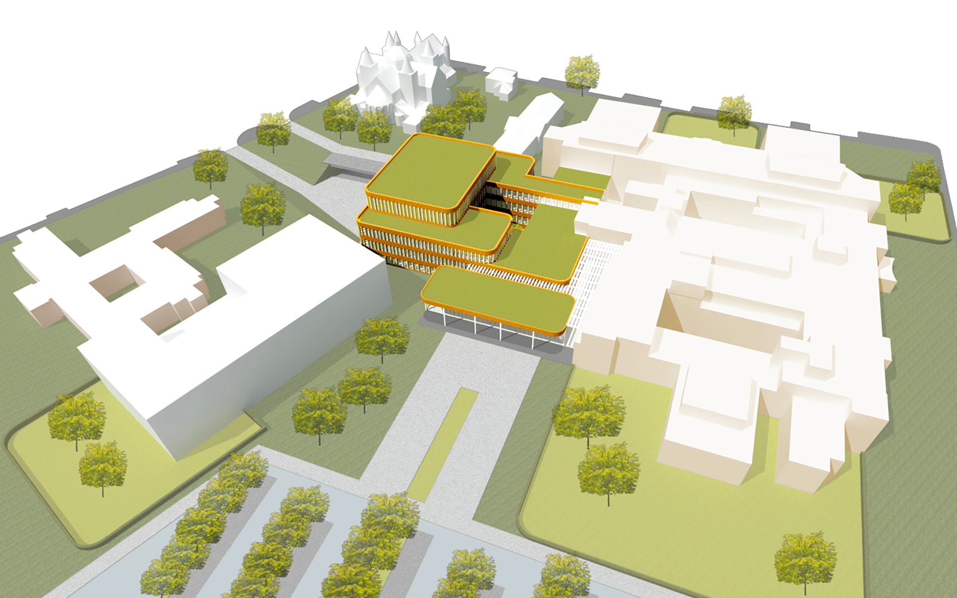
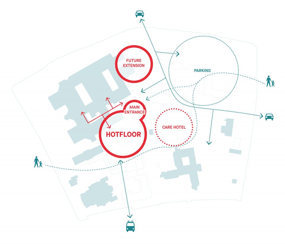
In terms of structure and dimensions, most of the existing building was actually fine. We proposed to “lift” the hotfloor out of the old heart and build a new hotfloor next to the existing building. This would create a light inner street—the building’s new backbone—that connects old and new, while also allowing for a beautiful, logical entrance. In other words, our knowledge of functionality, technology, logistics and care processes allowed us to surprise our client with a valuable, unexpected solution. And what’s more, it can be carried out in steps.
Daylight and orientation
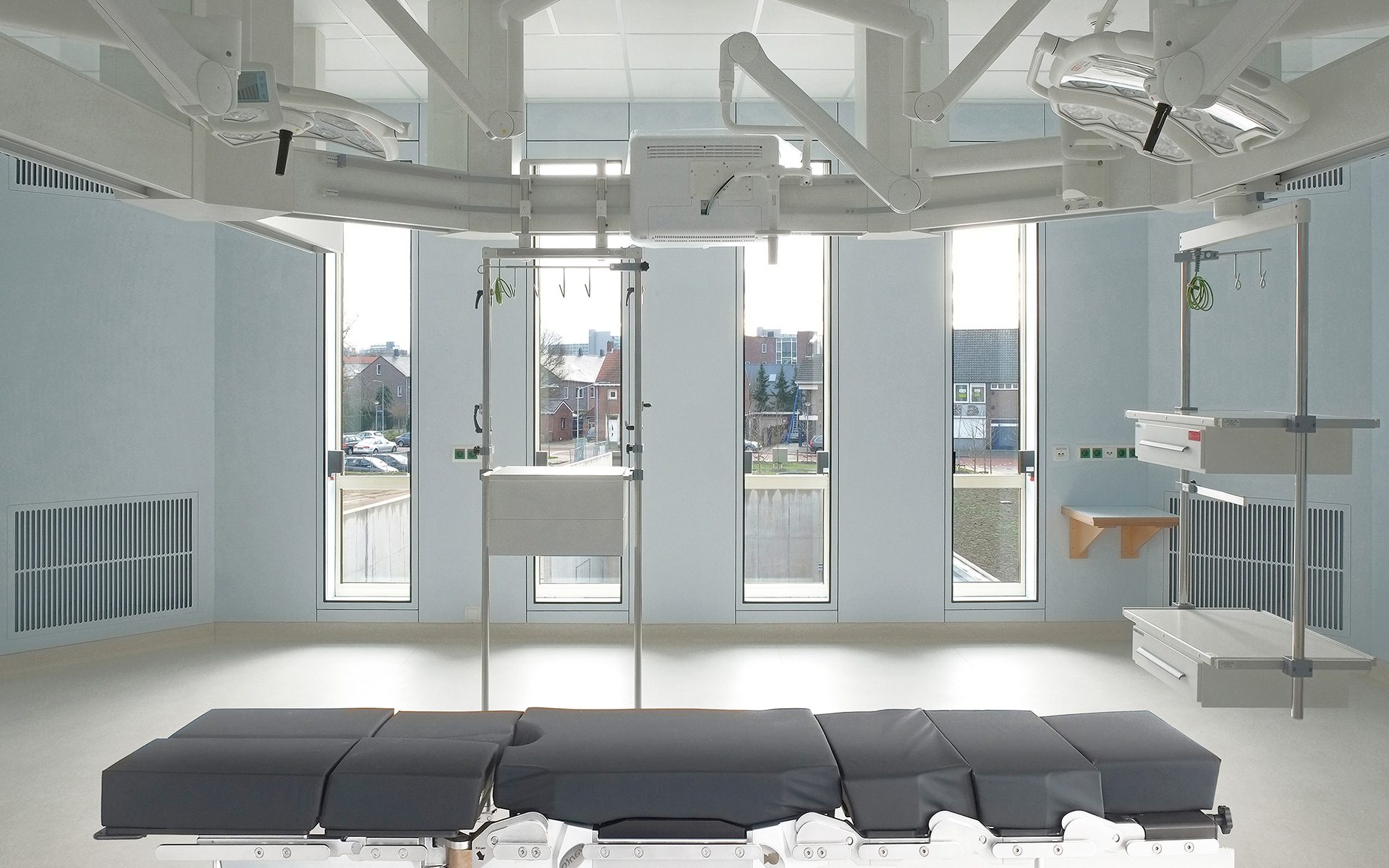
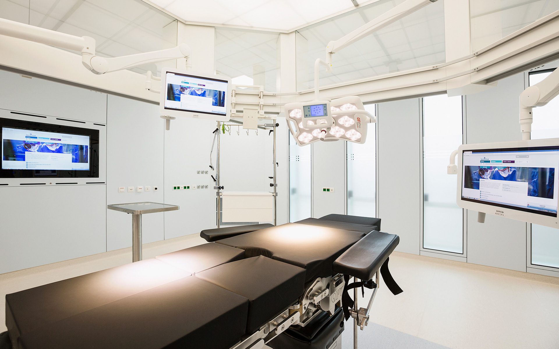
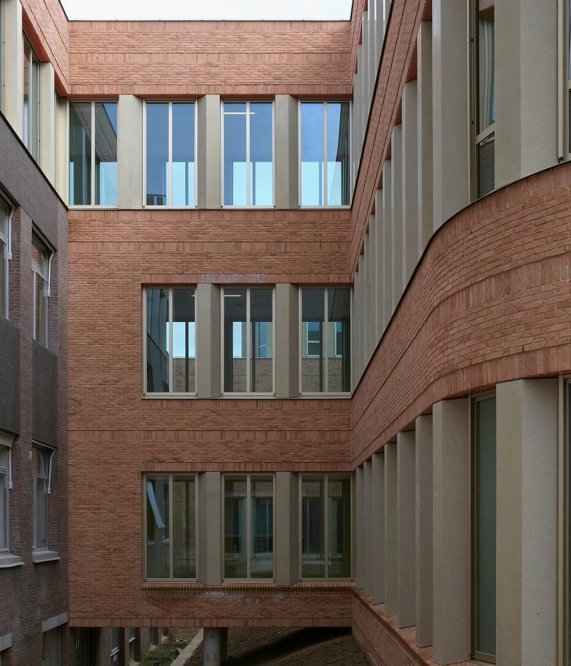
The existing hospital buildings will continue operations and be renovated in phases by the hospital itself. In the meantime, we will create the new hotfloor, which will house the emergency room, OR, ICU, acute care ward and the cardiology department. This new section will have a patio, so that we can provide daylight and orientation even in the most technically complex part of the building. Patients will always have contact with the outside world. The ORs will be located along the facade and thus receive daylight as well. The logistic entrance will be at basement level and extend into the existing basement underneath the entire building, so that nowhere will logistic processes interfere with care.
Respect for what is
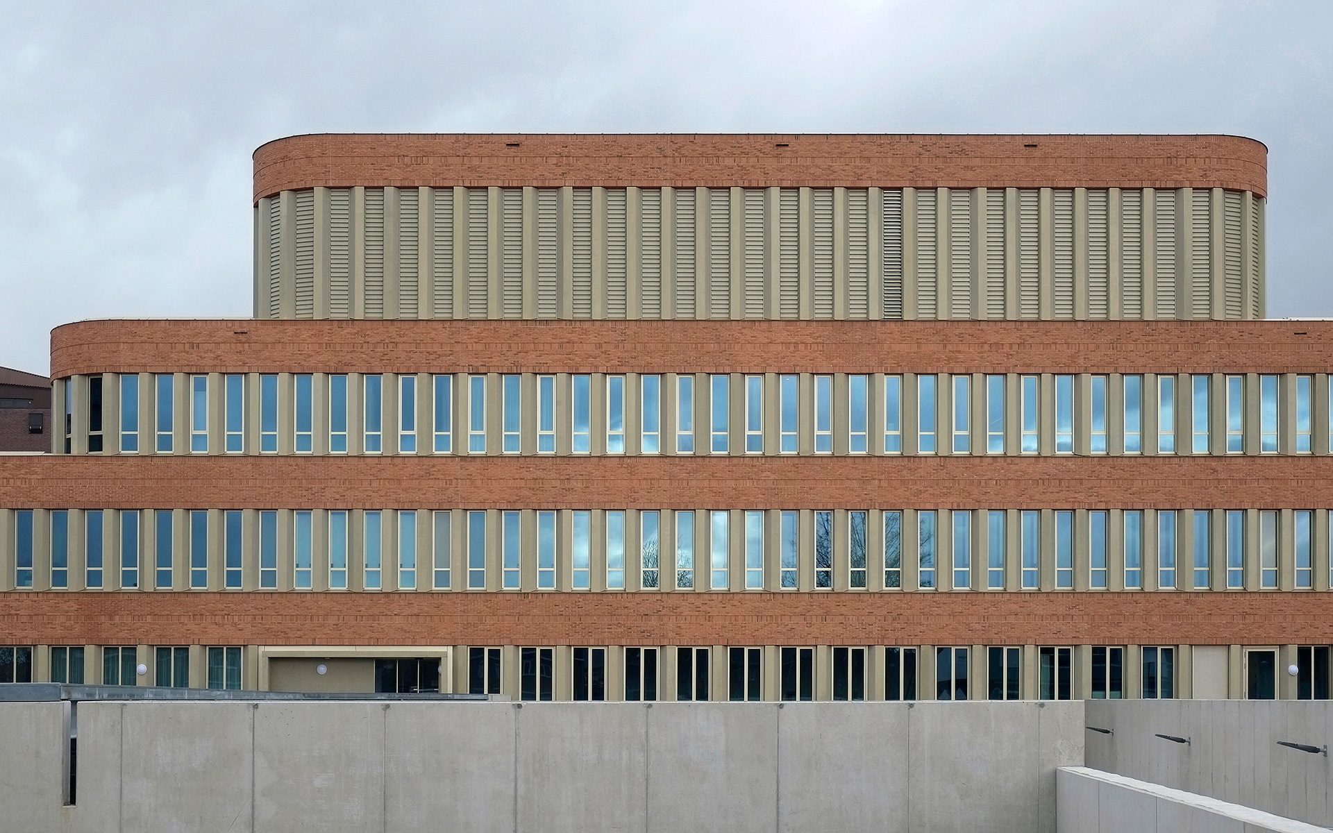
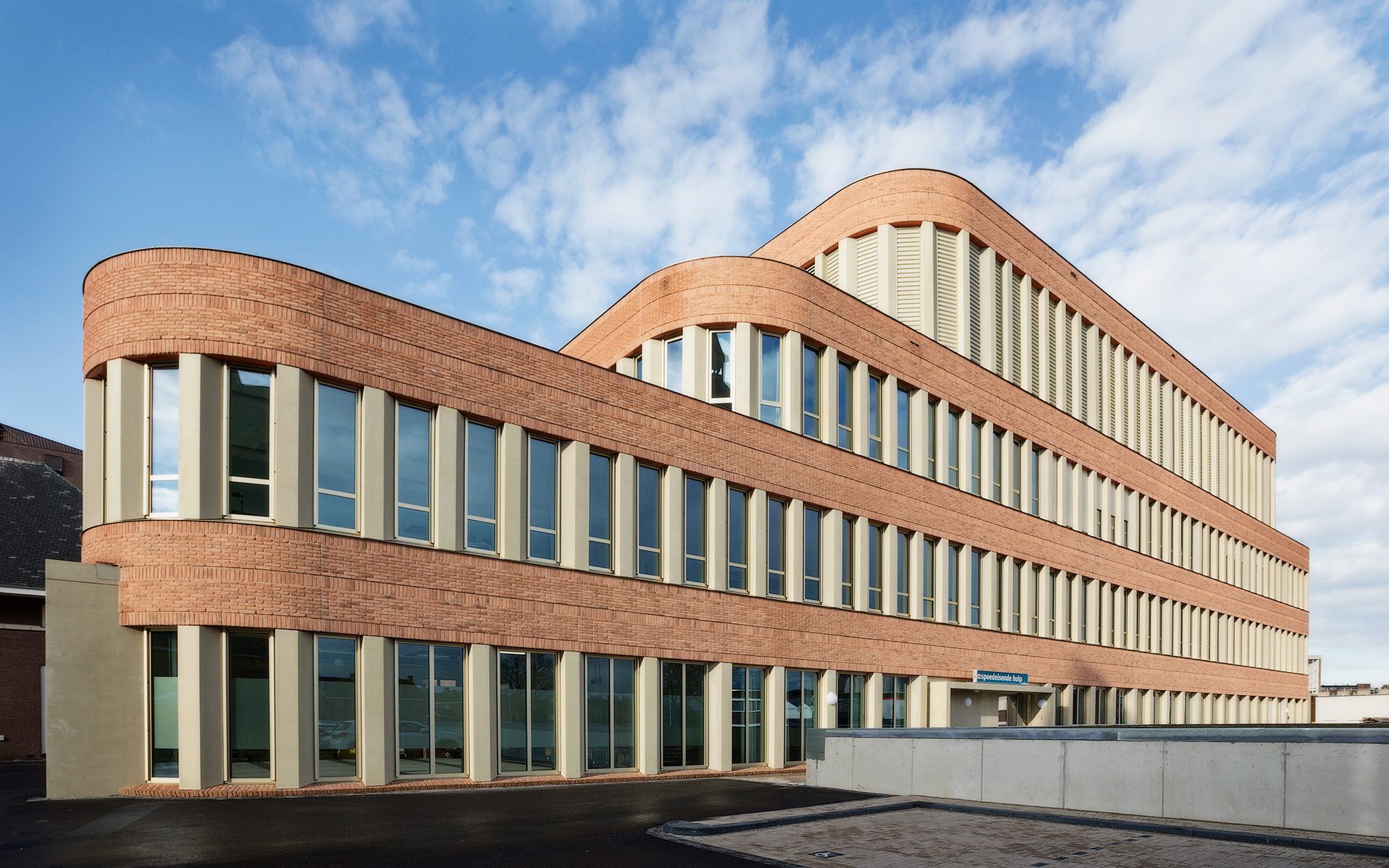
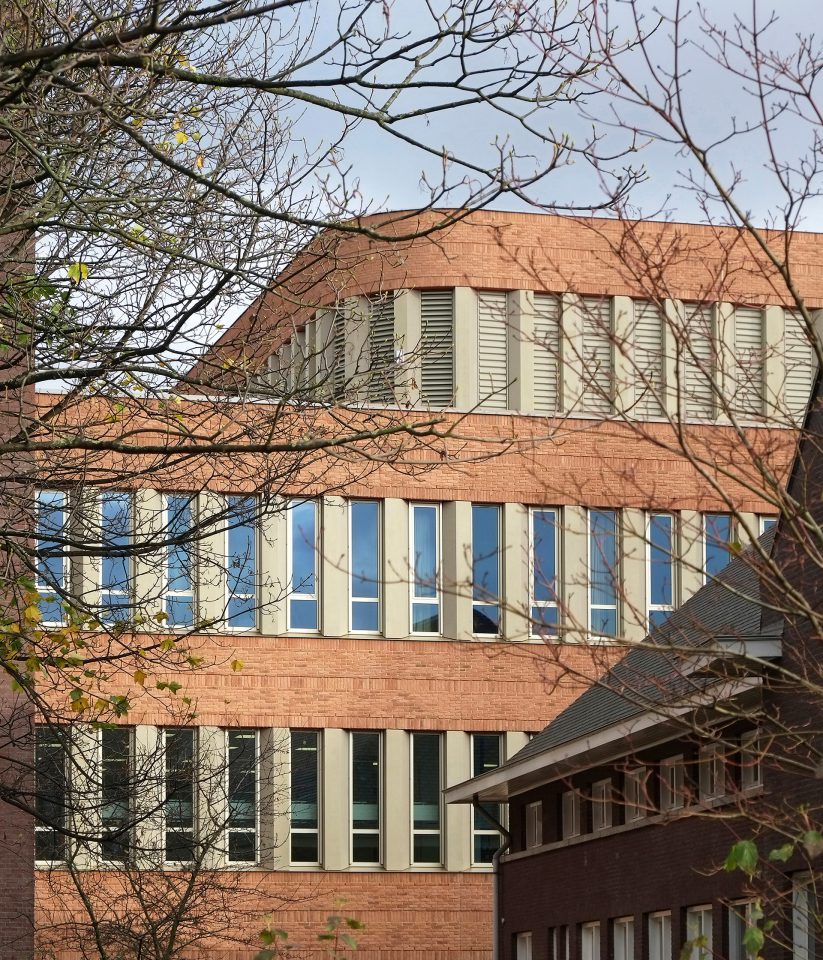
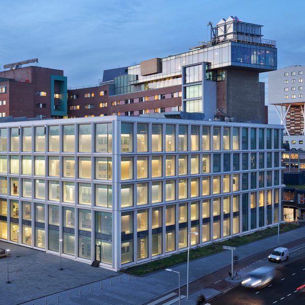
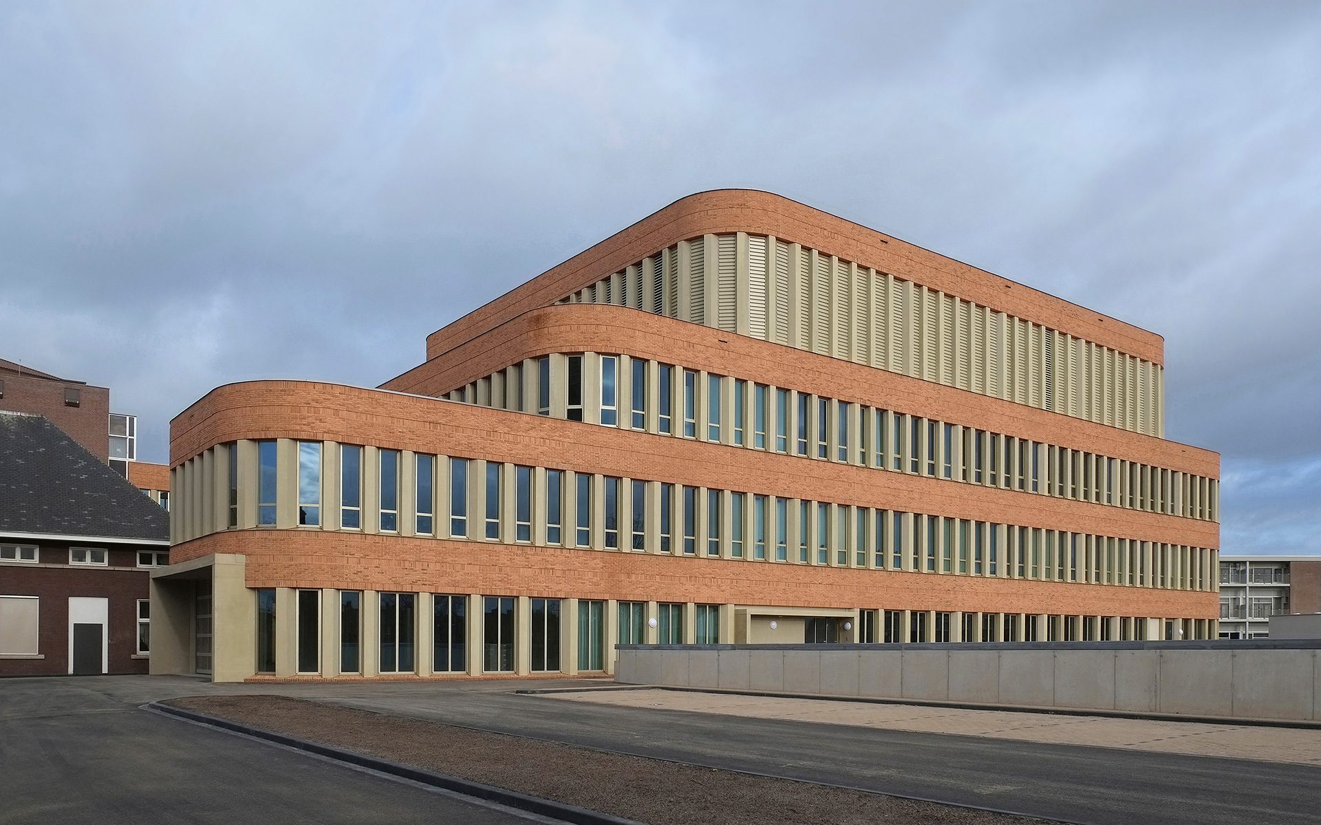
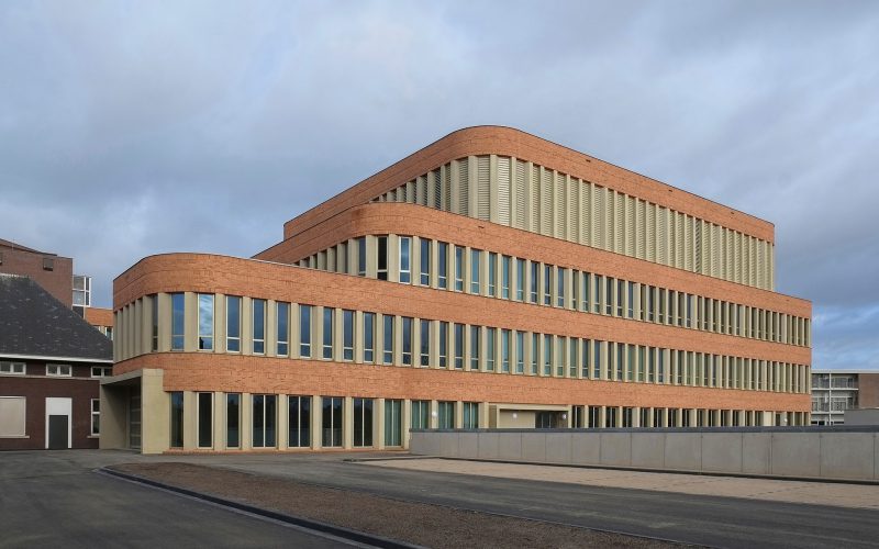
The original, yellowish brickwork on the old buildings will be continued on the façade and entrance of the new hotfloor. To freshen things up, we will use a slightly brighter stone that makes the outside of the hotfloor a little bit sunnier. In other words, we aren’t aiming for contrast. Rather, we’re using the new construction to showcase the value of the existing buildings.
Power of colour
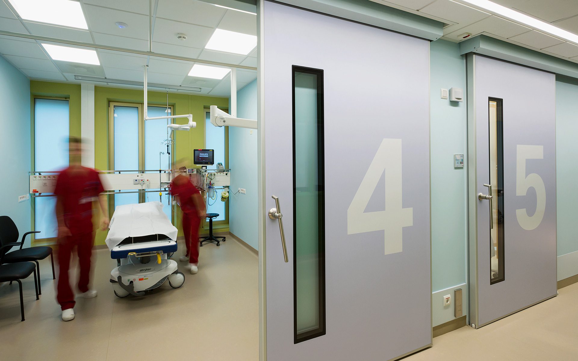
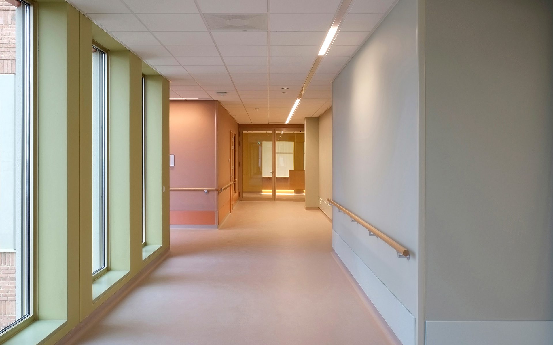
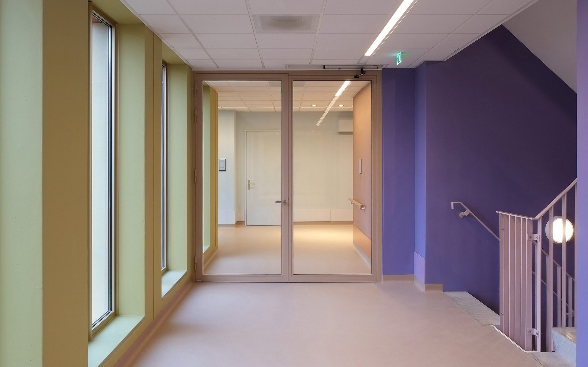
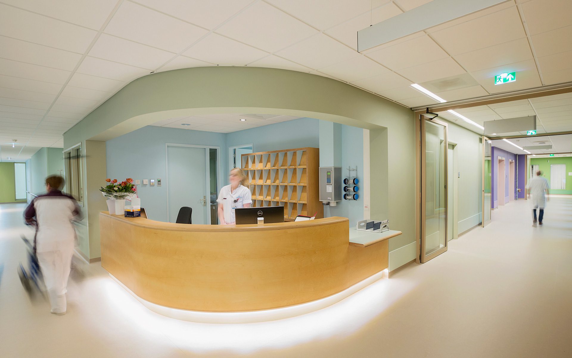
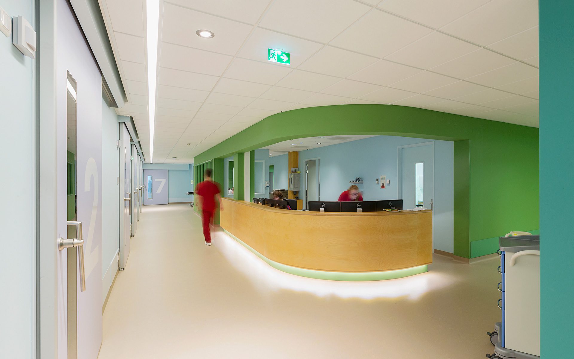
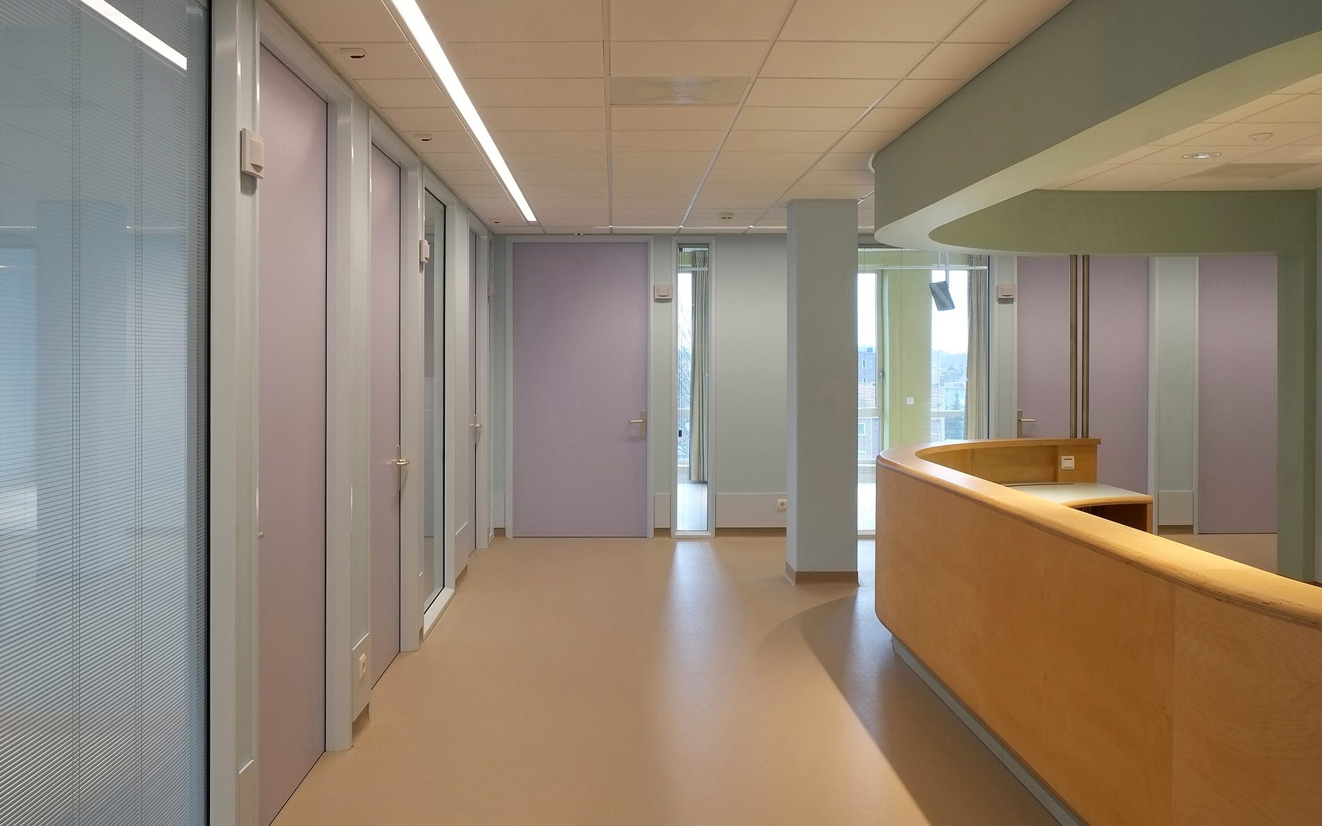
The yellow-green and beige spaces between the windows form an optical connection with the interior. Inside, the unique colour palette, conceived by colour expert Peter Struyken, really stands out. Struyken’s use of color enhances orientation and is important for regulating the incidence of light. The absence of white on the walls is striking. The standard white found in many hospitals has been replaced by a soft blue.
“Architecture is the result of an investigative process. With the new hotfloor, we were able to take the hospital to another level, without having to bring it to the ground. ”
“Architecture is the result of an investigative process. With the new hotfloor, we were able to take the hospital to another level, without having to bring it to the ground. ”
Project data
- Location
- Roermond, the Netherlands
- Functie
- OR, ER, GP, AHC, ICU, CCU, Cardiolology Department, CSSD
- Size
- 11,994 m² GFA
- Period
- 2011 – 2016
- Status
- Complete
- Client
- Laurentius Hospital
- User
- Laurentius Hospital
- Team
- Frank Pörtzgen, Koen Arts, Martijn Akkerman, Bastiaan Buurman, Inge Geurts, Joost de Jonge, Ruud Hilderink, Gert van Rijssen, Joris Alofs
- In collaboration with
- Arcadis, AT Osborne, Haskoning, Cauberg-Huygen, Peter Struycken
- Photography
- Kim Zwarts / Karel Bingen


