Maasstad Hospital
Rotterdam, the Netherlands
A city
in a city
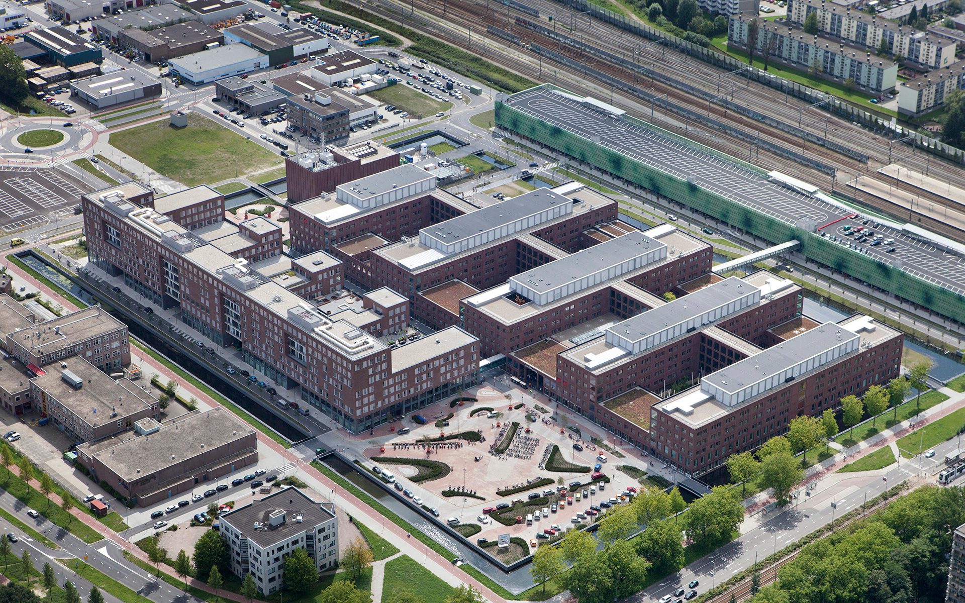
When we first got involved with the design of the new Maasstad Hospital in 2001, the area where it was to be built was still on the outskirts of Rotterdam—a patchwork of busy roads, railway lines, industrial estates and allotments. Thus, we saw the assignment as not only the design of a hospital, but as a challenge that would require vision and guts. We would have to create a new piece of city. And what does that mean for the architecture of a new, large hospital?
Vision and guts
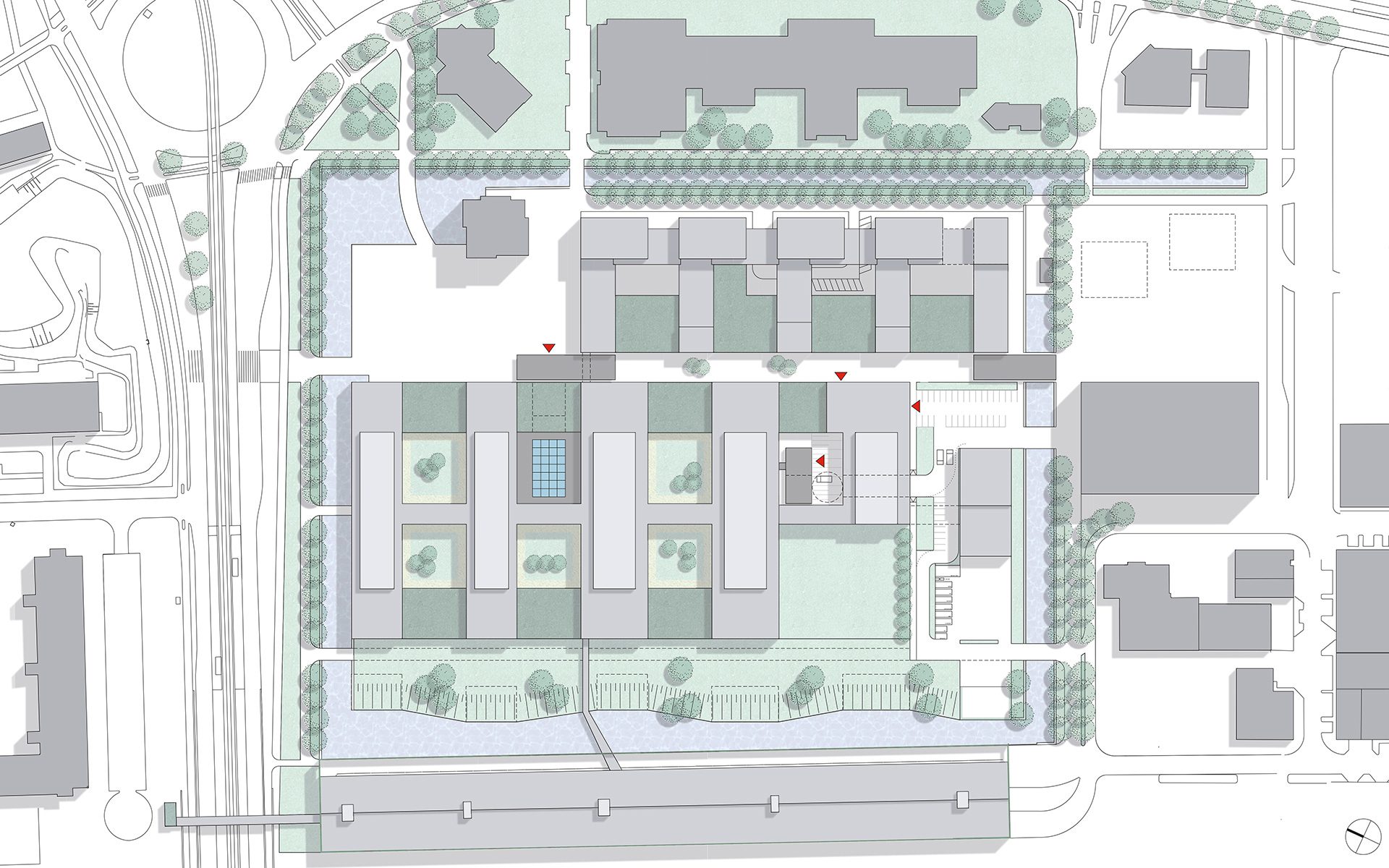
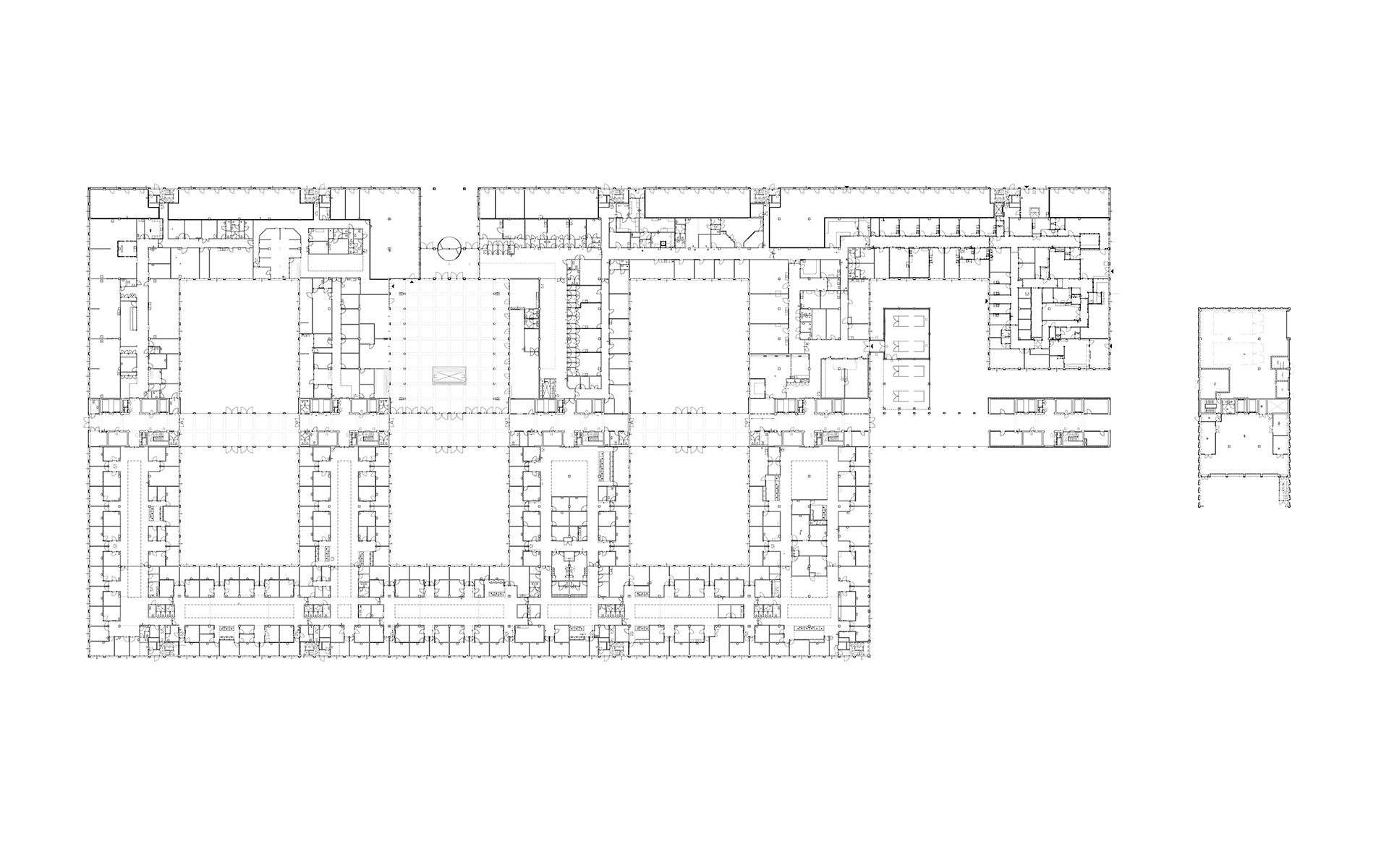
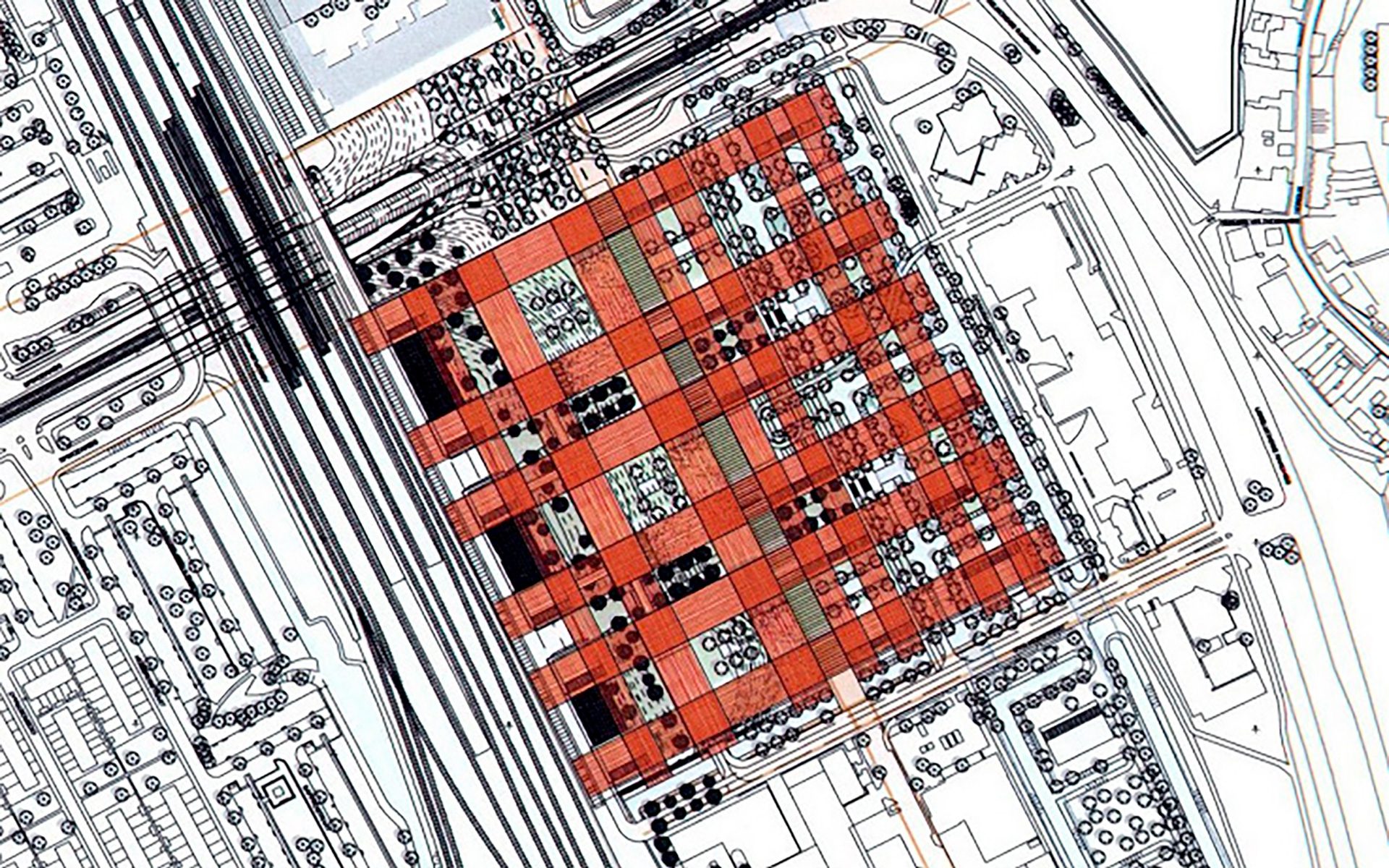
We won the assignment based on our vision and effective hospital concept. We compared our design to a Scottish tartan, a woven network in which all kinds of urban structures can be created. This horizontal and vertical grid ensures that the new building is logistically efficient, practical and flexible, making it easy to change its function in the future. And, with future care needs in mind, we also included a complete care boulevard right next to the hospital.
Flexible in use
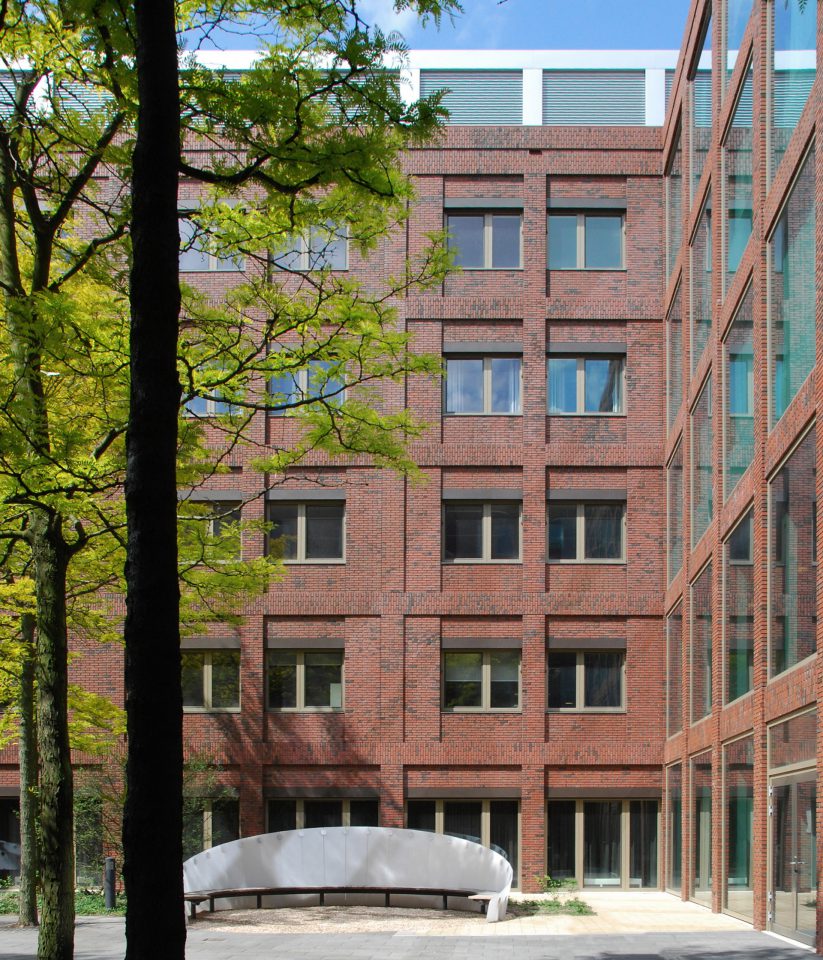
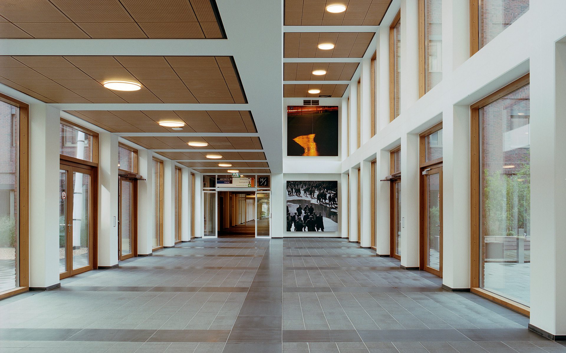
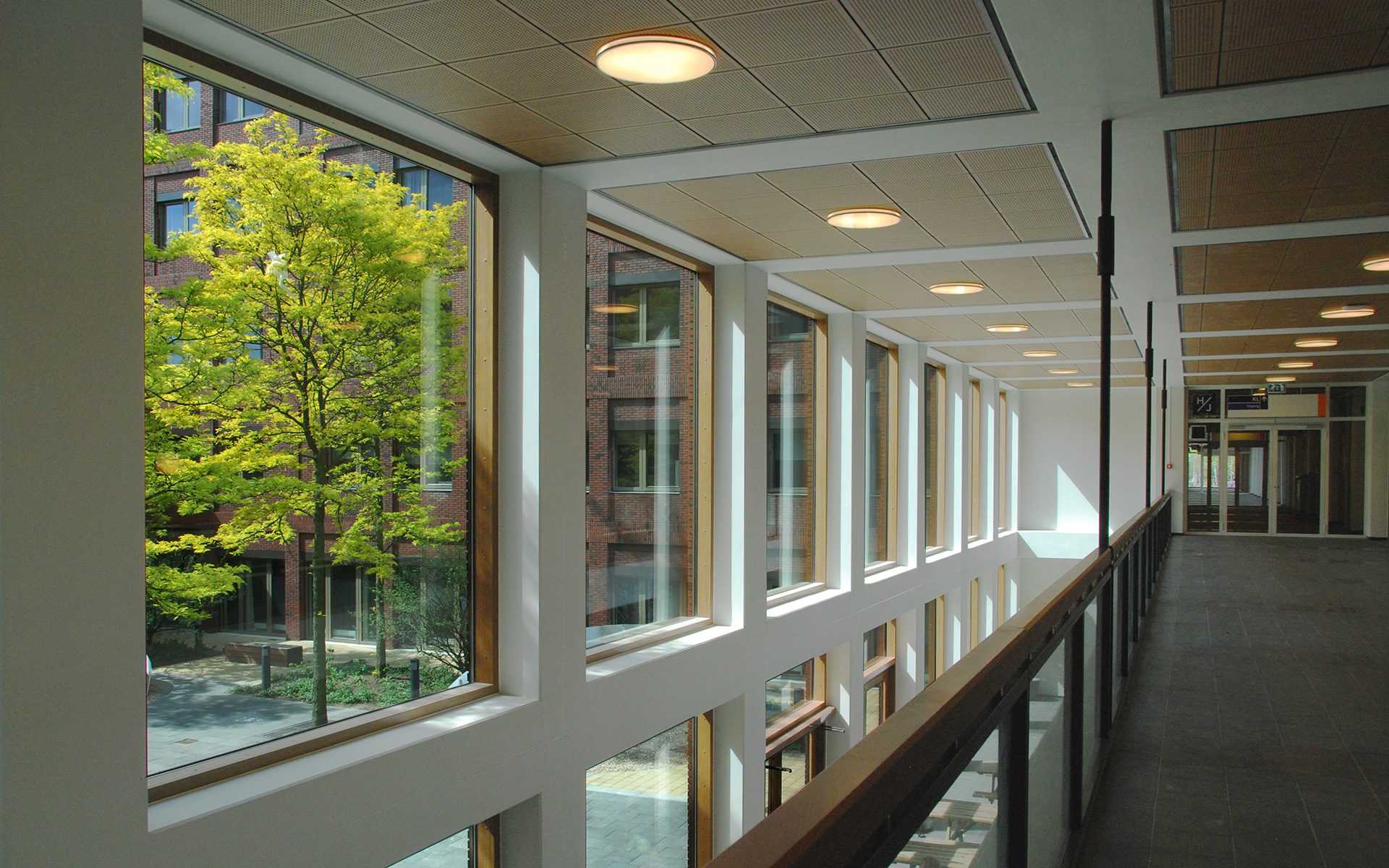
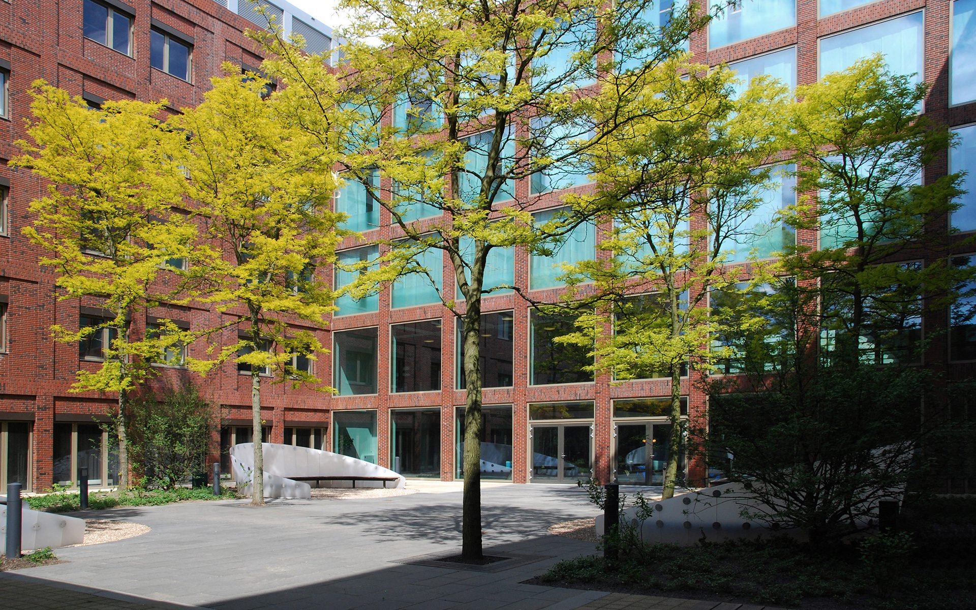
For a long time, the double comb structure was considered the most logical building form for hospitals. Viewed from above, this structure has a central axis with the various departments protruding on either side, like the teeth of a comb. This design may be efficient, but it’s not very flexible—all of the wards become dead ends. We decided to connect the “teeth” on the ground floor and the first floor, a new idea at the time. The result is a hospital that can flexibly expand or downsize departments and functions, based on developments in healthcare and medicine. As a result, large patios were also created, providing light, pleasant views and places to sit and enjoy the natural surroundings. The hot floor and IC departments are clustered in one building section. The nursing wards have an unobstructed view all the way around and are located in the higher parts of the building, where there are also roof-top gardens.
Industrial but subtle
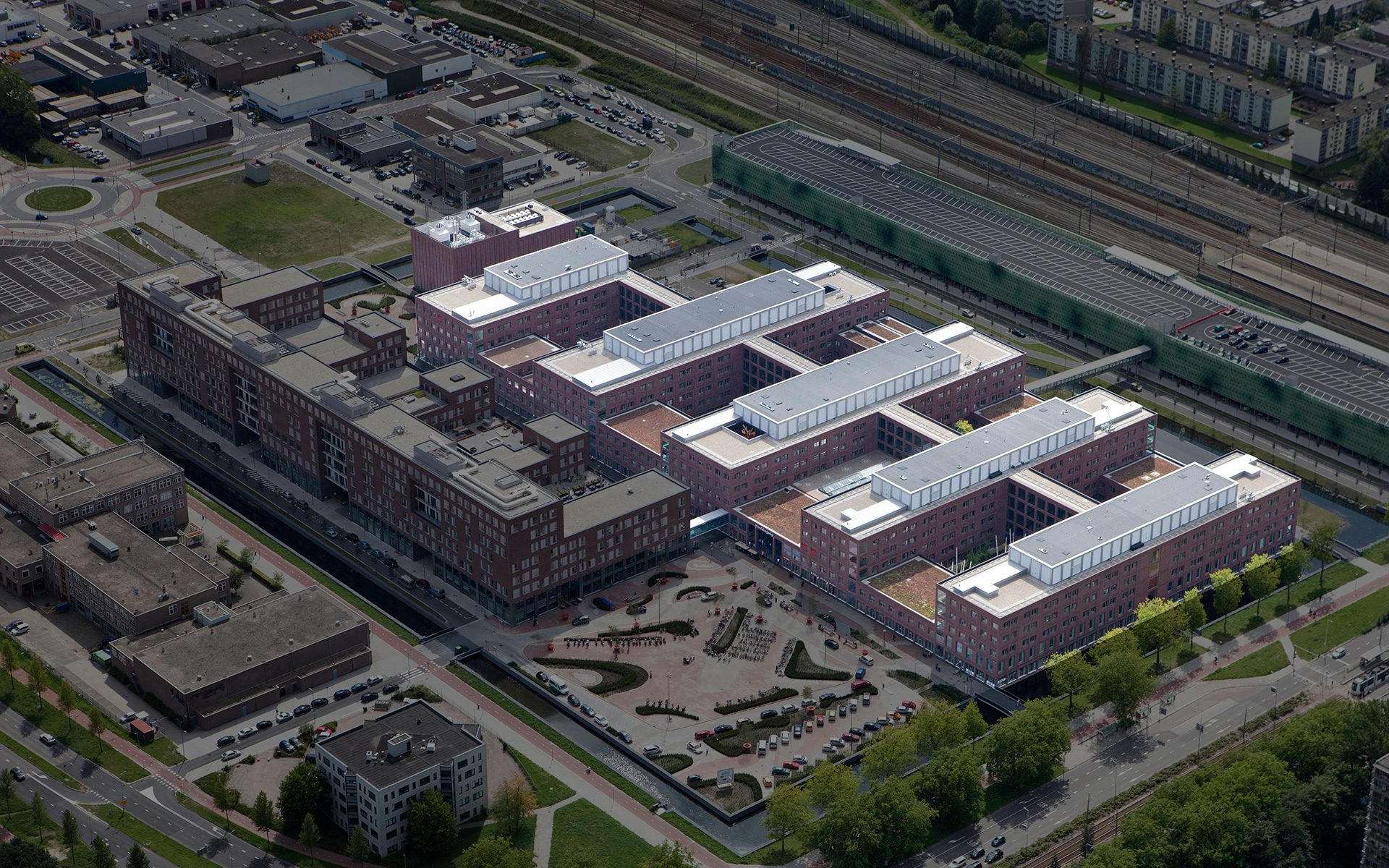
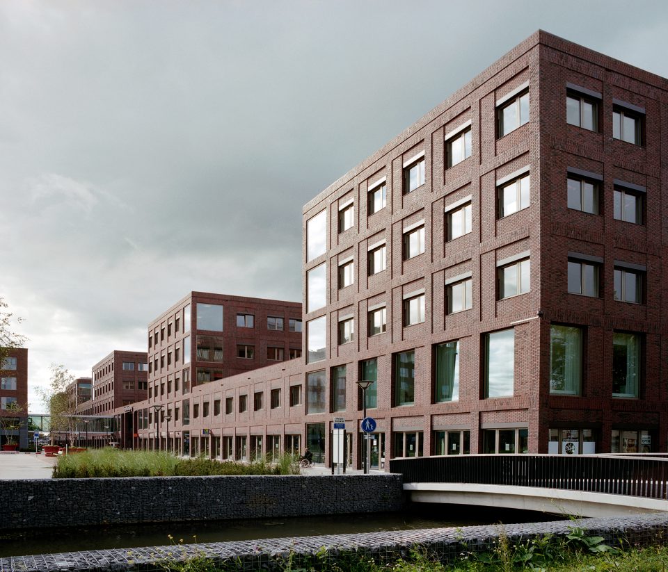
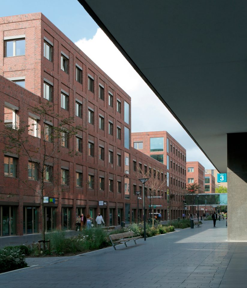
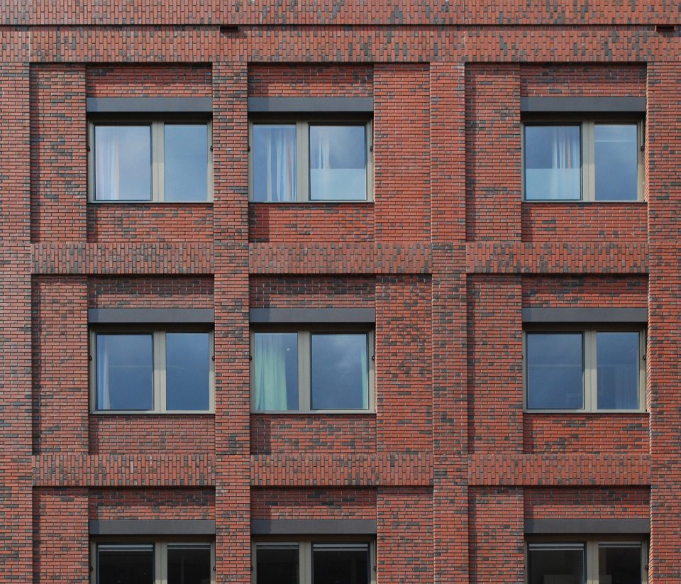
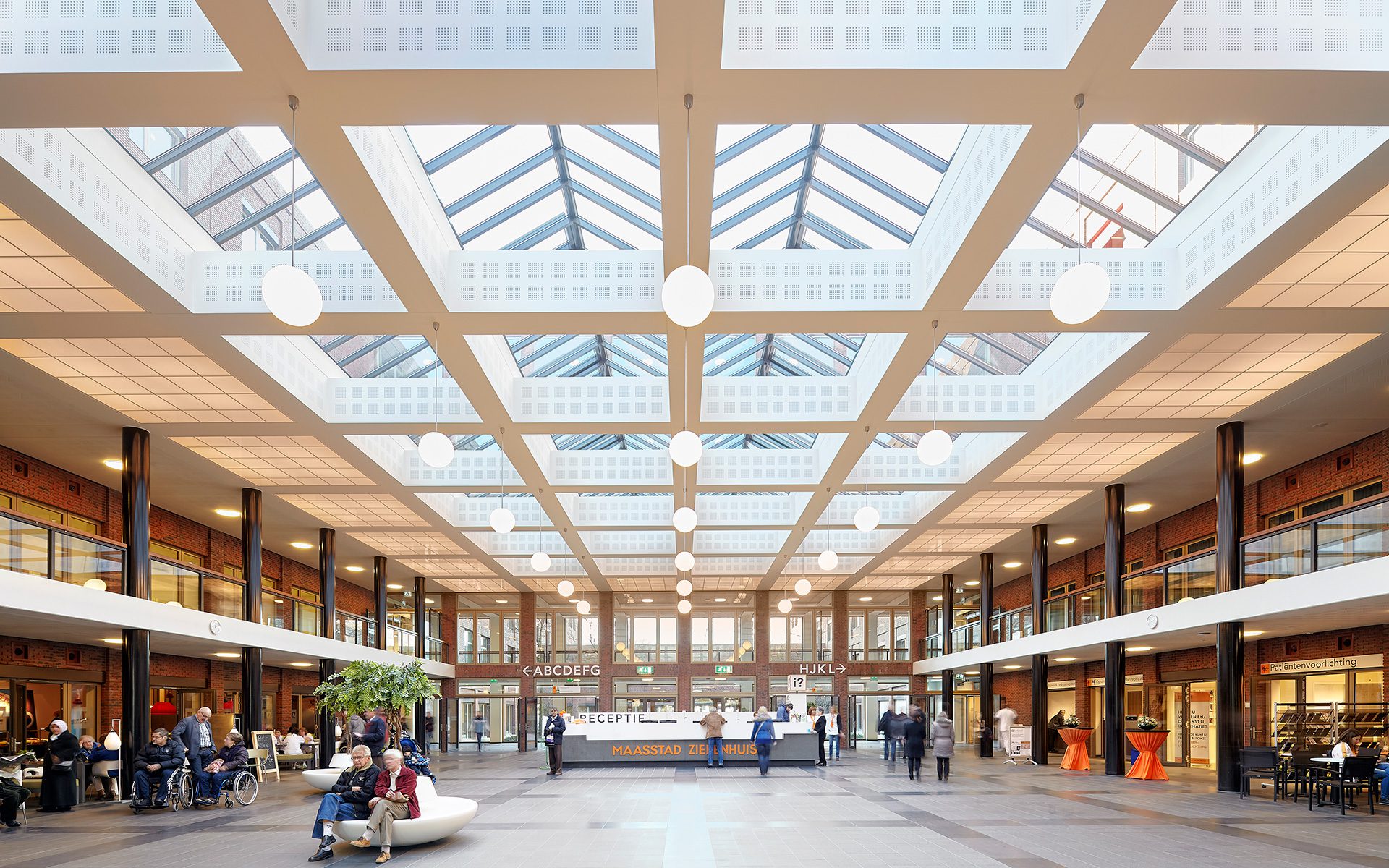
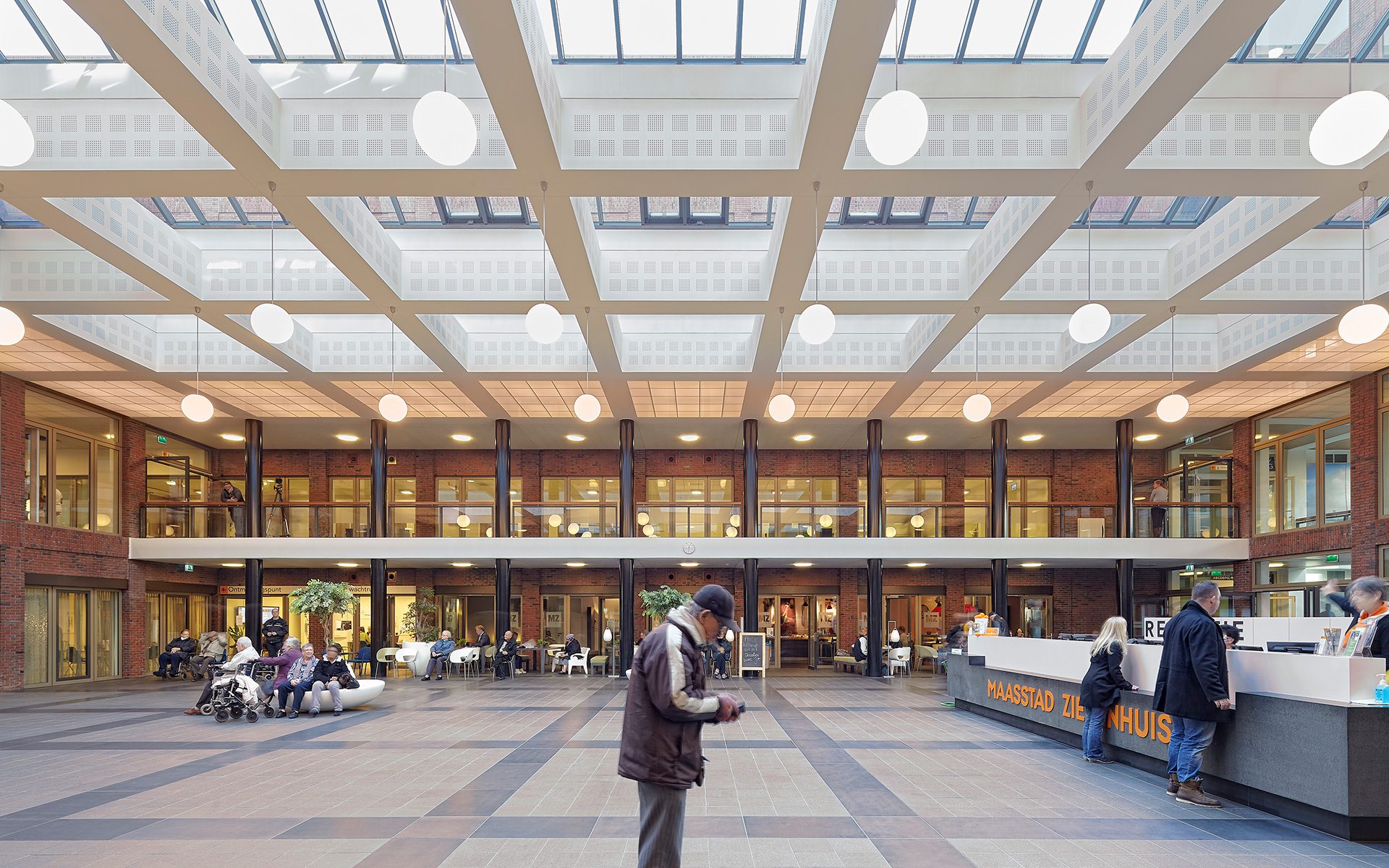
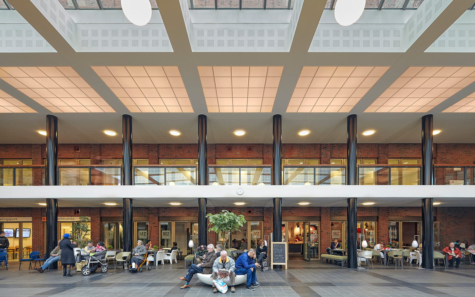
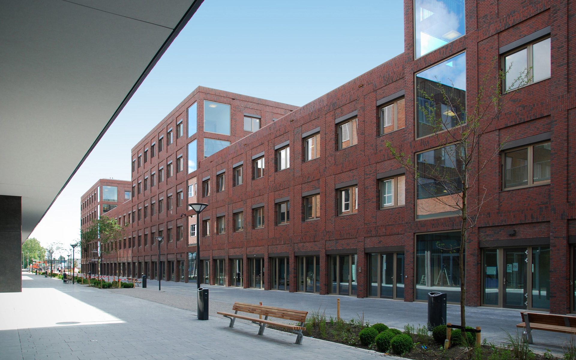
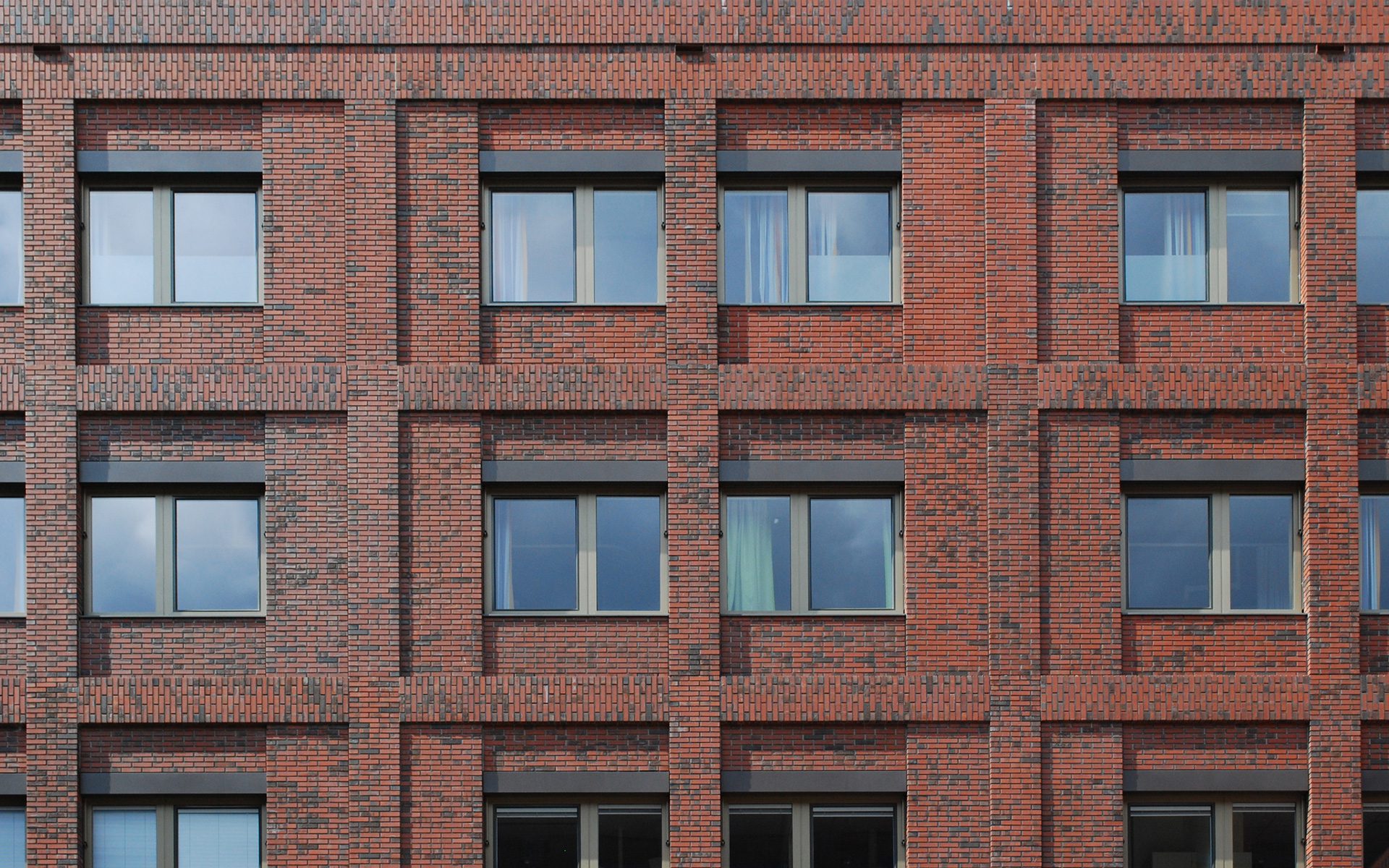
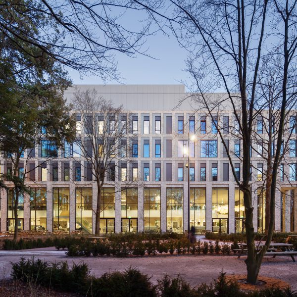
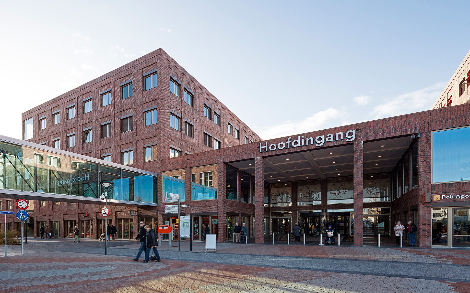
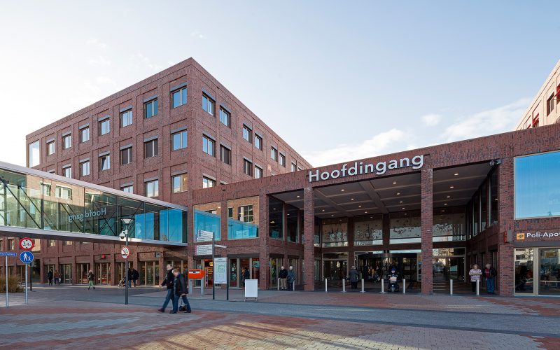
Maasstad Hospital is a city in the city, with squares, streets, patios and a broad, central axis. The monolithic building has a timeless appearance, and it almost looks industrial from a distance. If you come closer, however, you will also notice the slightly sunken, staggered parts in the façade, which is made of beautiful German brick. This gives the building a surprising subtlety. At the same time, it is very sustainable: its basic, urban design will allow it to be used for a wide variety of other functions in the future. Maasstad Hospital is an excellent example of the kind of true sustainability that Wiegerinck strives for: a building that retains its value for a very long time and doesn’t need to be destroyed because it has only been designed for one specific function.
“With timeless architecture, we have created a sustainable building that is much more than a hospital. It can easily be transformed into a hotel, office or apartment complex in the future.”
“With timeless architecture, we have created a sustainable building that is much more than a hospital. It can easily be transformed into a hotel, office or apartment complex in the future.”
Project data
- Location
- Rotterdam, the Netherlands
- Functie
- New construction of general hospital
- Size
- 84,000 m² GFA
- Period
- 2001 – 2011
- Status
- Complete
- Client
- Maasstad Hospital
- User
- Maasstad Hospital
- Team
- Jarno Nillesen, Paul Numan, Geert Jan van der Rakt, Joris Alofs, Frans van Aken, Hans Beekhoven, Alphons van de Berg, Henk Ellenkamp, Peter van Leeuwen, Stefan Opitz, Wouter Jan de Pagter
- In collaboration with
- ptg advies, Haskoning, Goudstikker-deVries, Stijlgroep
- Photography
- Kim Zwarts / Gerard van Beek


